Discover the 5 interior design color trends for 2020
Lifestyle & Trends
TUESDAY, october 29, 2019
The WGSN color bets.
TIPS: How to use them in your projects?
2020 will be the year that a super-futuristic vision becomes reality. For years we’ve been imagining life in 2020, and now the worlds of technology and science are turning these dreams into reality. The year 2020 comes full of transformations and colors are no exception. The buzz around these futuristic times will drive a trend towards colors that capture this sensibility.
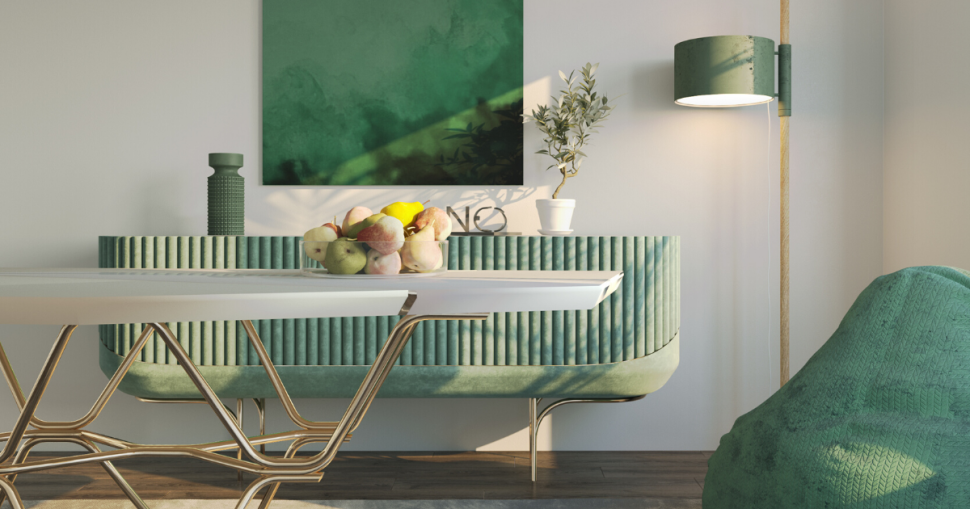
NEO MINT This color, in addition to its futuristic and modernist aspect, also refers to nature, thus causing a sense of harmony and peace. Because it is so soft allows numerous combinations, from the most neutral colors to darker. Neo mint is fantastic for those who want to get away from the typical white or gray but don't want a very strong color. At first, it is recommended to apply it on decorative objects or more delicate luxury furniture. If you want to use this color in a room, apply the color to one wall only.
PURIST BLUE Immediately after neo mint, purist blue stands out. This color refers to the contemporary strand. Even though it is the last stage of the blue color, it has added memories of the sky and the sea, bringing therefore the nature in its genesis. Therefore, it applies to all genders and ages, with strong appeal to technological, decorative and automotive appliances. “It's a nicer blue, sunnier than the cobalt of recent seasons, but it's still cold,” says WGSN expert source. This trend color is ideal to match the golden and black tones and achieve a contemporary and sophisticated decoration.
CASSIS In a mix of pink and lilac, the color cassisappears. WGSN ranks it as the third color that will be on the rise in 2020. Following the success of millennial pink and ultraviolet, the cassis color gains space. A little softer than the previous two, but enough to make an impact and make the difference. This color is set to stand out in 2020.
CANTALOUPE In a softer strand of orange, which has been a trend in the last season, comes the cantaloupe (melon orange). Also known as the “nice orange” because it is easier to combine than previous oranges and ideal for contemporary decor. “It's a typically feminine tone and perfect for interior decoration,” comments WGSN expert source. If you want to create a more contemporary decor, bet on the decorative chairs or armchairs, small objects or in the walls.
MELLOW YELLOW
The last color is loved by some professionals and hated by others. It's mellow yellow, which comes ready to cause discussion. Of all colors it is undoubtedly the most controversial. However, it is also the most upbeat color of the five and perfect for use in some details, like accessories or small furniture objects as stools, being able to modify any decor.
Soft colors will be on the top choices in 2020, following a modernist and futuristic trend, according to trend forecasting service that WGSN has revealed.
We can show you all about our latest collection and the materials we used to give life to special memories. You just need to fill the form below and you will see it all.