Are you going to remodel your home? Redesign your store? Do you know where to start your Interior Design project? Defining the style and furniture are vital points for the project, but one element is crucial and must be defined at the beginning: THE COLOR PALETTE.
We have already explained in this post how colours influence and enhance our well-being, so nothing is more important than defining the colour palette with which you want the final result of your work.
We see many homeowners who are afraid of colour. They get information from the real estate industry and well-meaning friends that bold or unusual colours will drive potential buyers away if they want to sell their space. We, the Architects and Designers of Alma de Luce, have a different view of colours.
The colour palette is a set of pre-selected colours used harmoniously to convey an idea, a feeling or the desired style.
Here's an excellent example of a project where the hero is the colour yellow.

Research shows that colour awakens mood and stimulates the brain in various ways. Specific colours stimulate the appetite and are plentiful in the kitchen. Other colours encourage creative thinking, focus and concentration and are great for offices and study spaces. But, if you need relaxation in the bedroom, fresh and muted colours are great for rooms like bedrooms to encourage this feeling.
When used correctly, the colour palette changes a person's perception of the environment. Therefore, the colour palette is essential, highly valued, and studied by architecture and decoration or interior designer professionals.
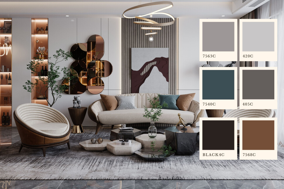
 Colour Palette for the project by Alma de Luce. Living room in Dubai.
Now that you know how important the colour palette is, the question is: how to create one? The first step in creating a colour palette is understanding colour theory and the colour wheel. Colour theory is nothing more than the study of colours, from how our brain interprets tones to the possibilities when applied in everyday life.

We reinforce that you should evaluate the environment's lighting and study the colour palette for the architectural and interior design.
"Lighting can change the appearance of colors. For example, natural light, in the morning, tends to be more orange, which embodies this tone on the objects and materials on which it falls. It transforms our perception of the colors of the environment. That's why it's important to think about colors and lighting together", recommends Sabina Costa, Architect at Alma de Luce.
It's the three primary colours, red, yellow and blue, and the compositions that give rise to secondary and tertiary colours that appear in The Color Circle. Your rational application can provide uses that avoid the tiredness concerning the chosen colours and the physical and physiological fatigue caused by poorly conceived colour conjugations.

In the image above, you can find the identification of the different types of colours:
Primary colours: Yellow, blue and red.
Secondary colours: Orange, Green and Violet that result from mixing the primary colours.
Tertiary colours: By mixing secondary and primary colours, greenish yellows, orange-yellows, etc. are obtained.
After understanding how colours are divided within the colour wheel and their effects on humans, it is crucial to know how their combinations work. This is what will bring harmony to your project, the well-matched colour palette.

Scheme 1: it is possible to combine 2 or 3 colours – or their nuances – that are neighbouring in the circle (pink and red type) or with an interval of a segment (navy blue with aqua green), the so-called "harmony by similarity".".
This scheme uses two or more colours located next to each other on the colour wheel. For the best results, you should select a dominant colour and the different colours should be used more subtly to prevent them from crashing.


Scheme 2: The colours opposite in the circle create a beautiful contrast and a striking decoration (like the coordination of green and pink)!


Scheme 3: You can also choose three colours, forming a triangle. Three equidistant colours are combined on the colour wheel, for example, blue, red and yellow. For best results, one has to be the dominant colour, and the other two colours should be used more subtly.


Scheme 4: There is also the possibility of combining four colours, forming a square or rectangle.


Scheme 5: Finally, a monochromatic combination with colours from the same family, varying only in tones: Starting with a key colour, and the other colours must be of the same tone but with different intensities. To obtain better results, small notes of the colour opposite to the key colour should be used.

With the use of light colours in monochromatic harmony, the environments will become more expansive, lightweight, and modern. The spaces are brighter and highlight the furniture and accessories.

Still not convinced about your colour selection? Consider getting professional help. Architects and designers can help you choose the right colours for your decor. You can do a little consulting or talk to someone who works in the field to get some valuable tips!
Choosing the perfect colours is essential when redecorating the house or redesigning the store. However, that doesn't mean you have to suffer with the choice. Running away from a combination that doesn't work out or the famous "carnival" of colours, where nothing matches and everything becomes a chromatic confusion. Following these tips, selecting colours in the decoration is much simpler and more objective.
Did you like our tips? So, stay tuned to our blog to receive more information and curiosities from the universe of architecture, interiors and construction!
You can also follow us on Instagram, Facebook and Pinterest for all our updates and news.