Colour is an element that is part of our world, not only in the natural environment but also in created architecture. It is, therefore, essential to understanding how colour influences architecture and interiors because the brain will process this colourful environment and judge what it perceives objectively and subjectively. Colour radiations even affect the blind. They can identify them, as each colour reflects a different temperature.
All this information makes the study of colour necessary in all activities related to Man and improving his living conditions. And the rational application of colour can provide substantial well-being to those who enjoy it.
Colours cause perceptions and exert a triple action on people that we must understand:
1. Colour is seen – Impress, draws attention.
2. Colour is felted – It provokes a reaction or emotion, as each colour can express itself.
3. Colour is constructive – Builds because each colour has its meaning and, therefore, the ability to build a language that communicates an idea.
If used efficiently, colour theory is one of the most potent tools in architecture and interior design. Colours are a form of non-verbal communication that says a lot in a fraction of a second. They can instantly create different moods, express feelings, invoke an emotional reaction or inspire people to act in a certain way. Colour influences exterior or interior architecture and how we perceive it, feel it and live it.
All people are subject to optical illusions produced by colour, which influences our perception of architecture, interiors and the experience of spaces.
Colour has temperature, weight, balance and space, laws that define its use. Every colour has a moving action. Visual distances become relative. So the visual field becomes elastic. For example, a black surface or a red surface illusory appears to be approaching. White or blue space seems to be moving away.
Colour is a powerful force from a sensory point of view that moves backwards and forwards and influences the information we perceive in architecture and interior design. Using colour, an object's volume can be changed, as can its weight. Two objects of equal volume, weight and shape painted with different colours look effectively distinct. Do we then begin to understand how colour influences architecture and interior design?
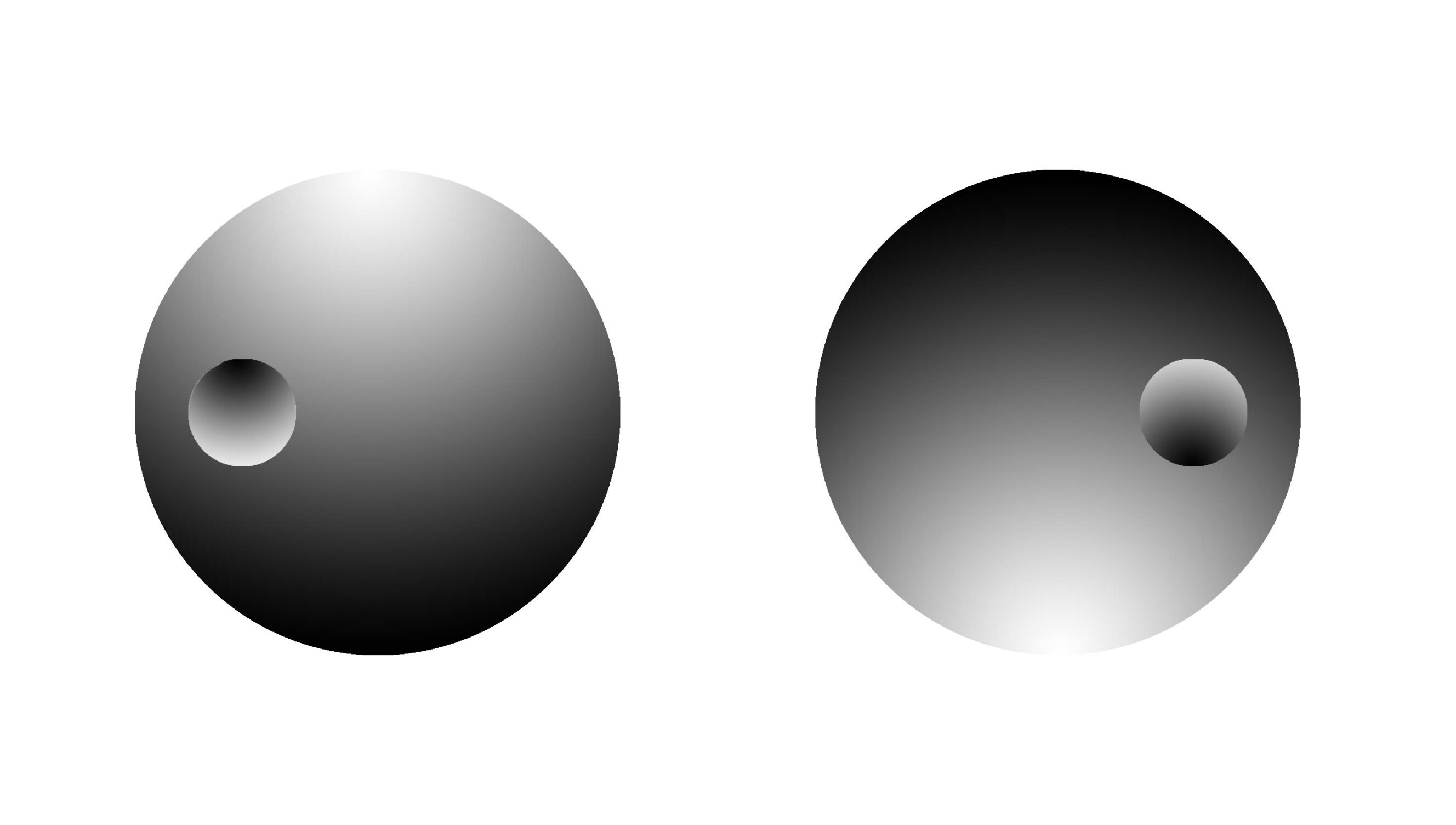
Also, games of shadows and light can create optical illusions. Due to the orientation of the illumination, the spheres below seem to have different dimensions. The smallest one on the left appears to be protruding from us. In contrast, the one on the right seems to be recessed. However, both have the exact dimensions.
According to their combination can be balanced a set of colours. The sensations raised by the colour and its combination provide this balance.
A typical example: Have you ever wondered why architects use green and blue colours in hospitals, not white? Wouldn't the colour white make more sense? And the obsession that Fast-Food restaurants have with the colours red and yellow? We will see further examples of colour's influence when creating indoor or outdoor spaces.
We know that the human eye can distinguish more than ten million different colours. There is, thus, an infinity of possibilities when it comes to colour combinations.
To this end, colour scholars needed to rationally and logically organize the colours they observed and create a system that facilitates their balanced use. This need led them to create a fundamental chromatic circle.
This part of the sun's white light breaks down into colours: red, orange, yellow, green, blue and violet. These colours are divided into primary or fundamental colours (yellow, red and blue) and secondary (orange, green and violet) that appear as a mixture of the primary colours.
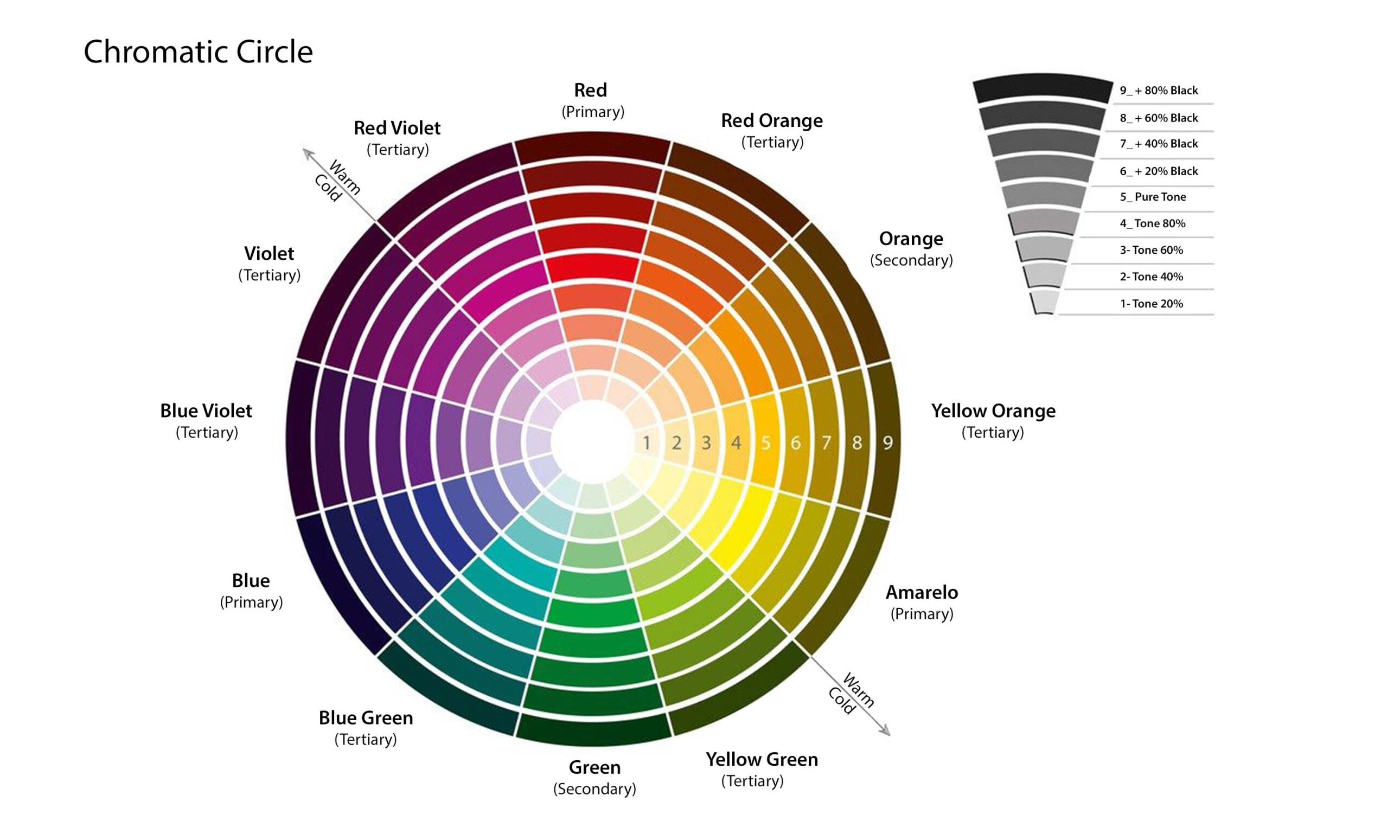
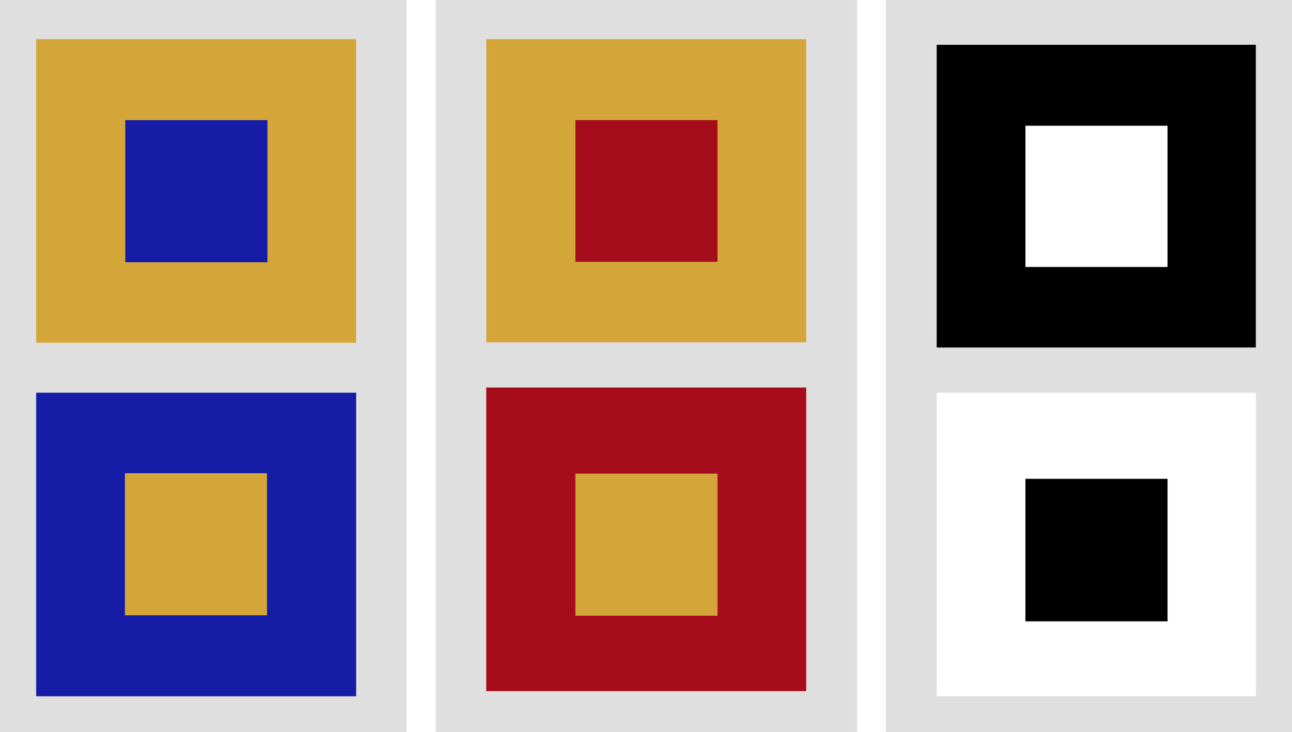
In a chromatic circle, the colours next to each other are similar: those with similar shades. Their proximity makes them simpler to work with and guarantees good results in various architectural, interior, and decoration projects.
Thus, the chromatic circle is a crucial instrument for understanding how colours relate to each other and how we can combine them in various conjugations.
Want to know more about it and how to combine colours and create the right colour palette for your interior project or stunning decor? Look here.
So to choose the colours you want to use in your environment, you must consider several factors. It would help if you thought about the colour effect of each element of a building's construction, from the earthy colours of primary building materials such as wood, stone, brick and marble, to the wide range of colours available for paint, doors, windows and cladding.
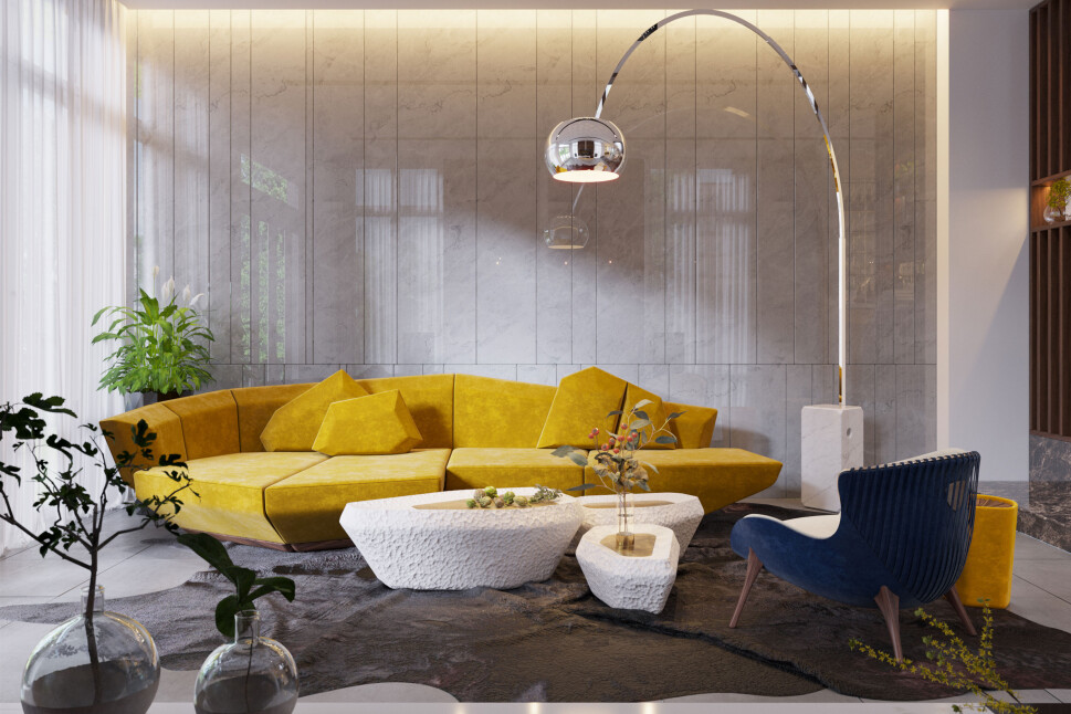
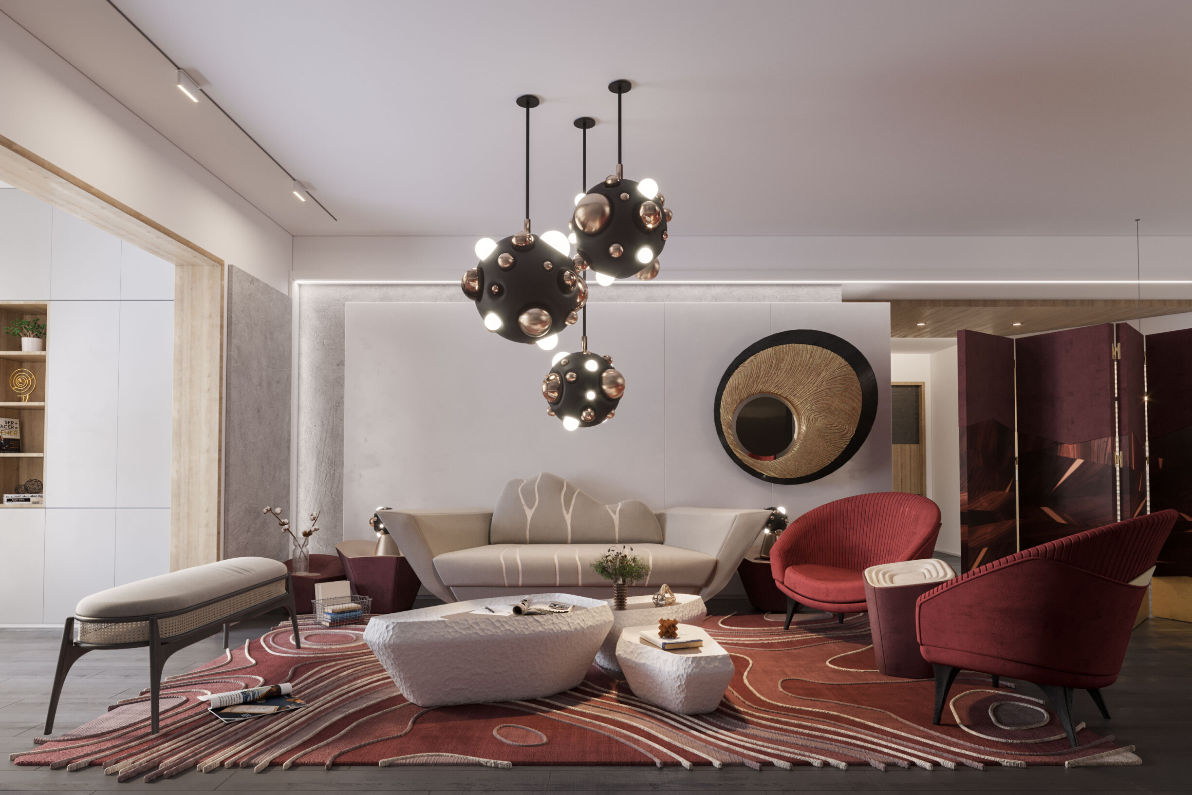
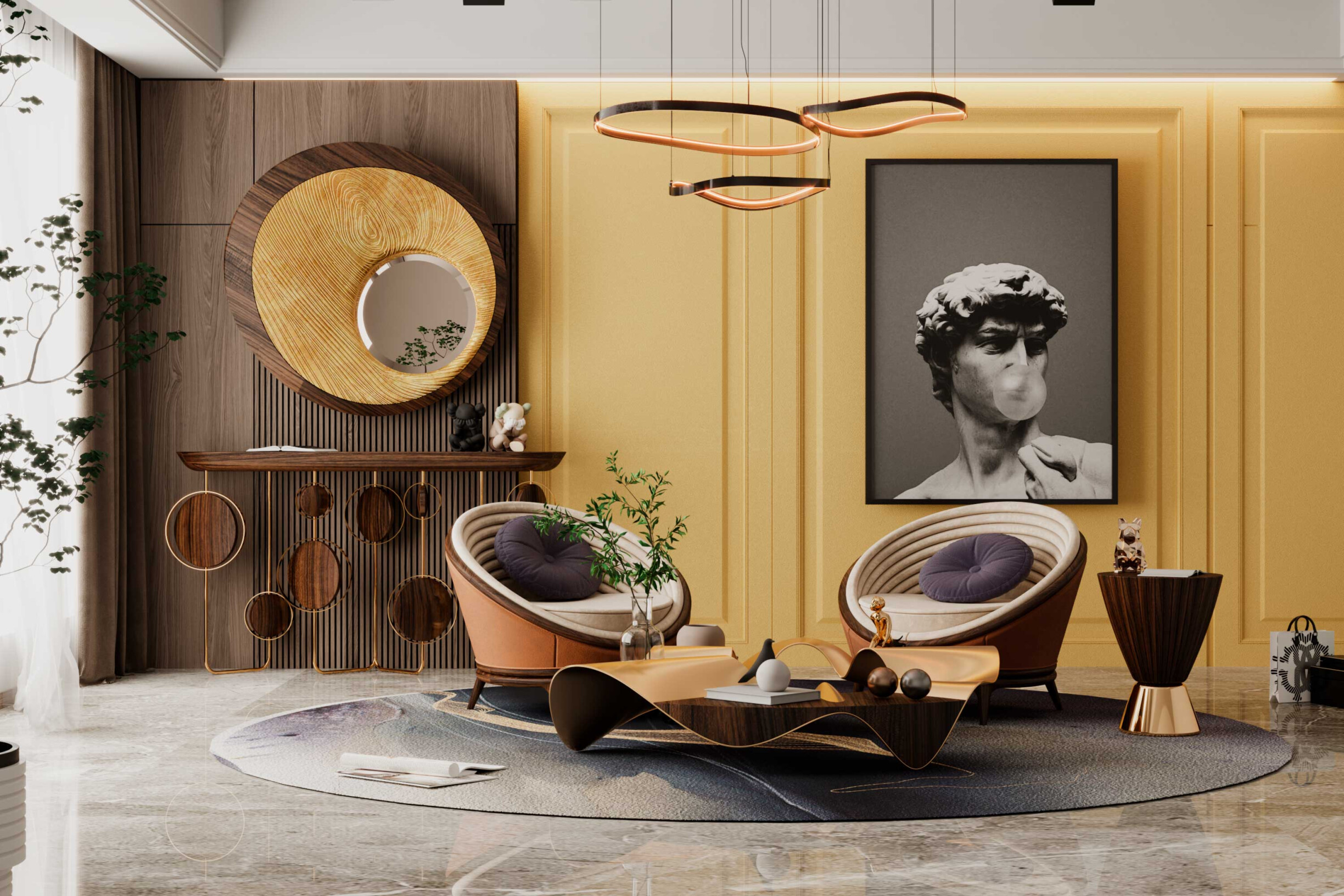
See the colour palette used in the interior design of a living room, which creates a fantastic atmosphere of cosiness, unique, contemporary style, meeting the client's personality. With the Interior Design Service, the Alma de Luce team produced a stunning interior with a combination of coordinated colours to make the jaw drop and warm the heart of the client and their visits.
Scientific studies confirm that colour influences us psychologically and physiologically. One of the most impressive results is the connotations of colour and associations of mood to colour, which have cross-cultural consistency from individual to individual and group to group.
Many studies comparing human beings worldwide, such as men with women, children with adults, laypeople with architects and even apes with humans, show that colour is an international visual language understood by all.
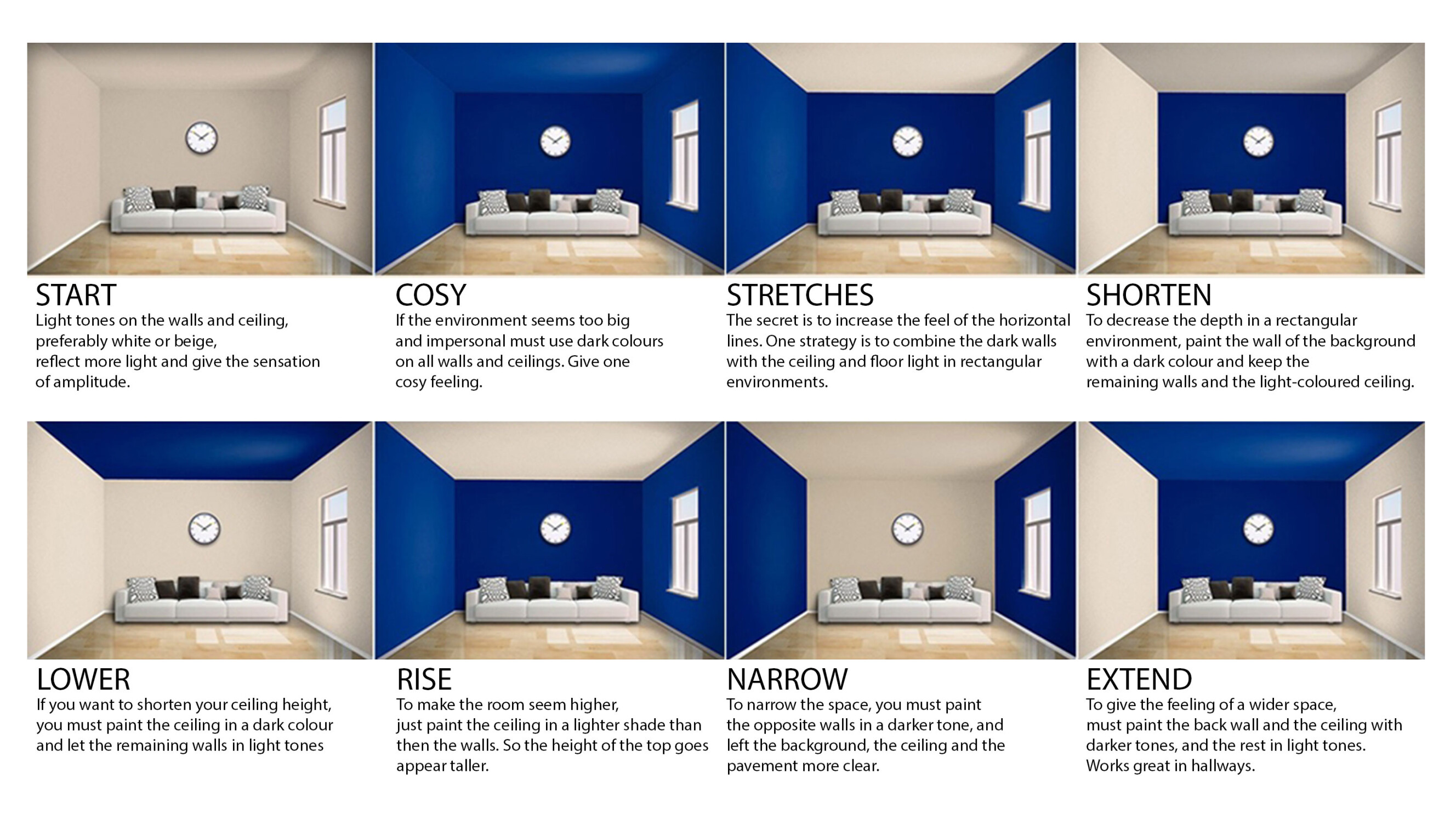
When an architect or interior designer creates an environment, it is critical to know the sensation of colour and the message that the colour transmit conveys. If we make a space with walls, floors and ceilings in neutral colours when we apply specific colours to different surfaces, we obtain other visual effects. Here are some examples:
#If we paint only the side walls of the space, there is a strong feeling of the narrower space.
# By applying colours to all the walls, we perceive a deeper space than it is.
# If we use a darker colour for the ceiling, we get the feeling of a lower area.
# But if we apply colour to the central wall of the space, the idea of a particular "spatial shortening" is visually created.
# If we want to reduce the room's height or place the focus at the viewer's eye level, then paint all the surfaces at half height and place the darker tones on the upper surfaces to achieve the desired effect.
# Otherwise, the room expands when painting the central wall and the ceiling in the same tone.
We also learn to respond to specific colours in different ways. For example, red means caution/stop/blood, but some reactions are subconscious. Colour thus has many influences on architecture and the way we perceive spaces in interior design.
A person is affected personally and universally by the colours in his environment. Studies have traced specific patterns of colour preference related to age, socioeconomic factors and character traits.
The younger a person is, the more likely they prefer more saturated colours, but as they get older, they choose lighter, less saturated colours.
However, since one cannot affect the individual's personal history about colour, the architect or designer is forced to design according to colour experiences that affect the vast majority of people in the same way.
Here are some examples, curated by Alma de Luce, on Pinterest of projects with colour.
Effect: exciting, stimulating
Association:
Positive: passionate, vibrant, active, strong, warm
Negative: intense, aggressive, furious, fierce, bloody
Character: Red is the most dominant and dynamic colour. The eye needs to adjust the focus, as the natural focal point of red is behind the retina. Consequently, red appears closer than it is.
Ceiling: intrusive, disturbing, heavy
Walls: aggressive, advanced
Floor: aware, alert
Example: Living room, a project by Alma de Luce
Effect: exciting, stimulating, uplifting
Association:
Positive: cheerful, lively, energetic, outgoing
Negative: intrusive, noisy
Character: Orange is less masculine than red. It has very few negative associations. However, it can feel cheap or lacking in vigour if it's low on saturation.
Ceiling: stimulating, attention seeking
Walls: warm, luminous
Floor: activating, movement-oriented
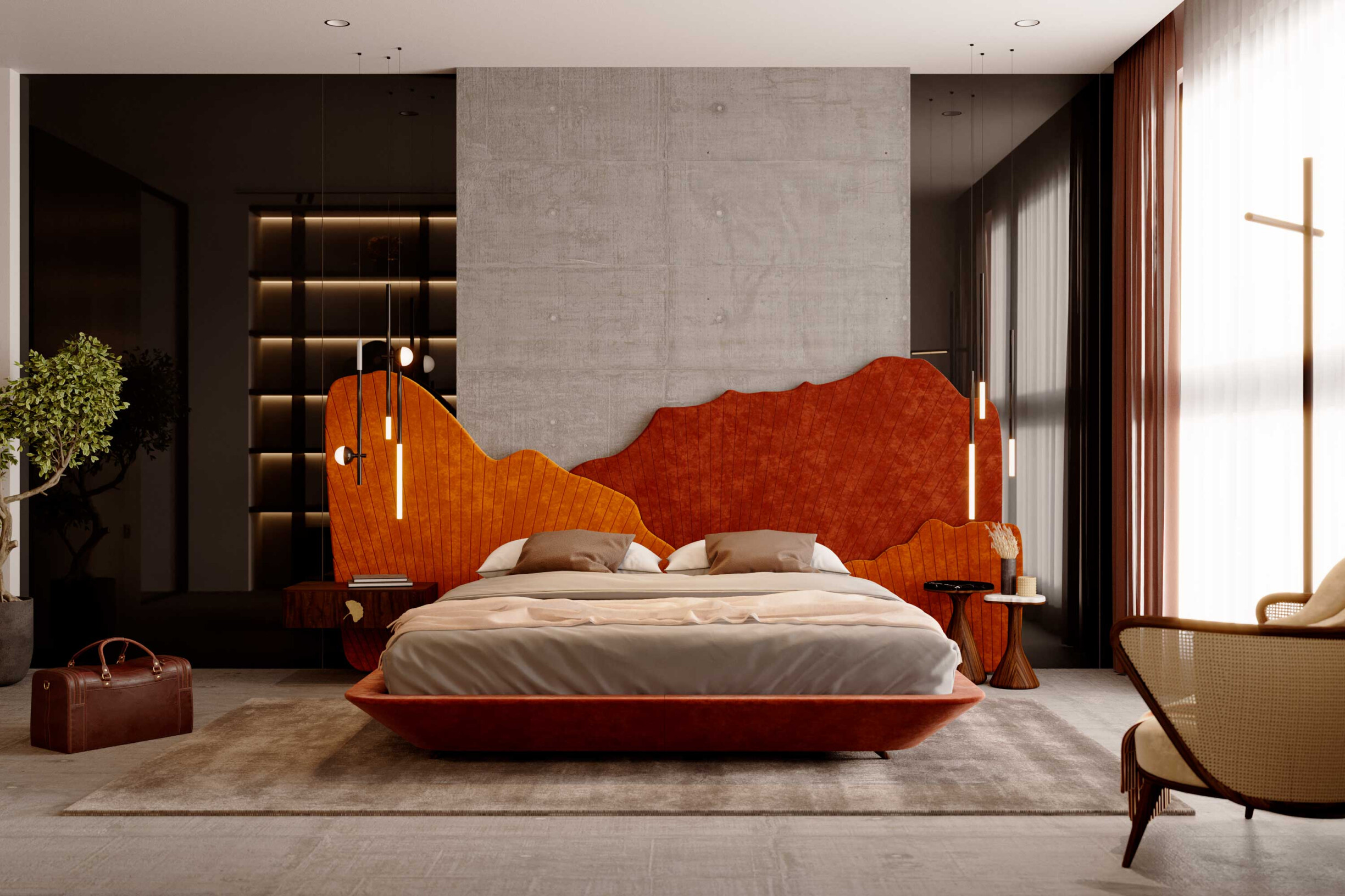
Example: Bedroom inspiration, uses the colour orange at several points. Design and project by Alma de Luce
Effect: twisted
Association:
Positive: sunny, cheerful, vibrant, vital
Negative: egocentric, blatant
Character: When pure, yellow is the happiest of all colours. It radiates warmth, joy and inspiration and signifies enlightenment and communication.
Ceiling: light (in the direction of lemon), luminous, stimulating
Walls: Warm (towards orange), exciting to irritating (if highly saturated);
Floor: Elevates, diverts;
Example: Entryway, uses yellow colour in several areas of the project. Project by Alma de Luce
Effect: withdraw, relax
Association:
Positive: peaceful, refreshing, natural
Negative: common, tiresome
Character: Unlike red, when looking at green, the eye focuses precisely on the retina, which makes green the most restful colour for the eyes. Green can symbolize nature but also mould and disease.
Ceiling: protective. Reflection on the skin may be unattractive
Walls: cool, safe, calm, reliable, passive, irritating if shiny (electric green)
Floor: natural (if not too saturated), soft, relaxing
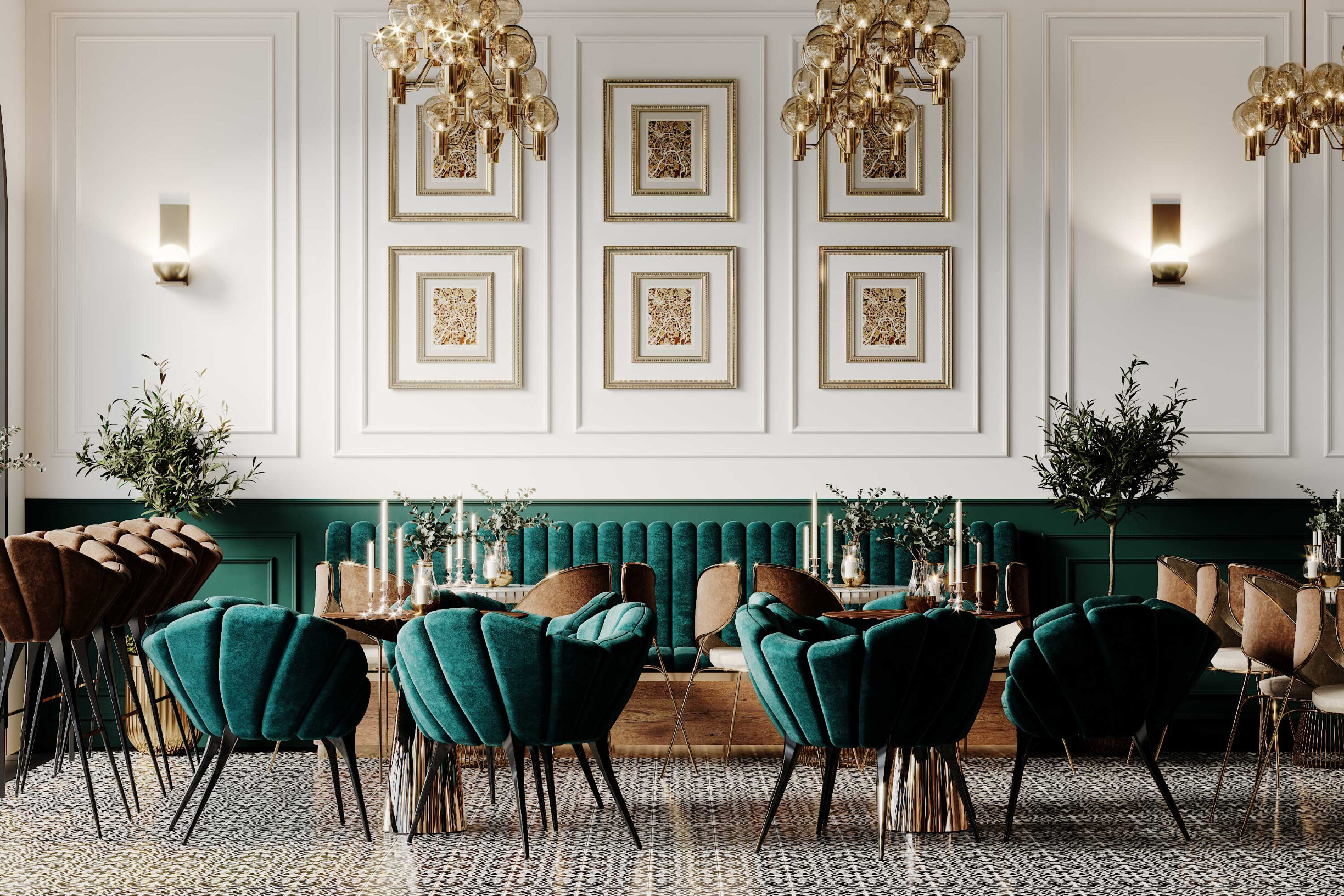
Example: Restaurant redesign for Murato Food, uses the colour green in the brand itself. Project by Alma de Luce
Effect: withdraw, relax;
Association:
Positive: Calm, sober, secure, comfortable, noble;
Negative: Scary, depressing, melancholy, cold;
Character: Blue appears to be transparent, moist, calm and relaxing. Unlike red, blue lowers a person's blood pressure and pulse.
Ceiling: heavenly, cold, retreating (if light), heavy and oppressive (if dark);
Walls: Cold and distant (if light), encouraging and space deepening (if dark);
Floor: Inspiring sensation of effortless movement (if light), substantial (if dark);
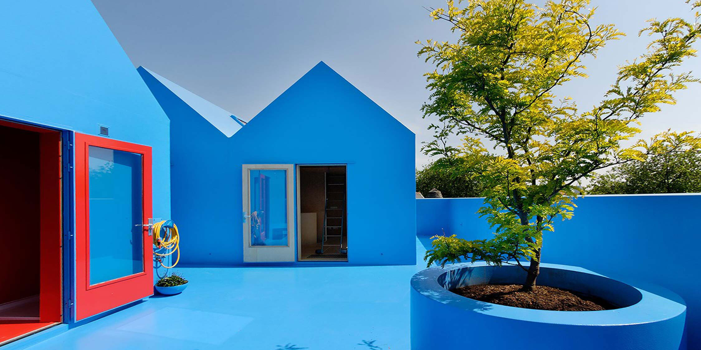
Example: Didden Village, uses the colour blue throughout outer space. MVRDV Project
Effect: Overpowering;
Association:
Positive: Worthy, exclusive;
Negative: Lonely, sad, pompous, vain;
Character: Purple or Violet is a mixture of red and blue (the two most psychologically opposite colours). Purple or violet can look delicate and rich or disturbing;
Ceiling: Bewildering, overwhelming;
Walls: Heavy, overwhelming;
Floor: Fleeting, magical;
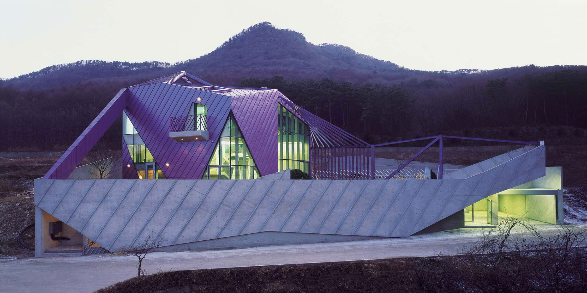
Example: Purple Hill House in Gyeounggi-do in Korea. Project by IROJE KHM Architects
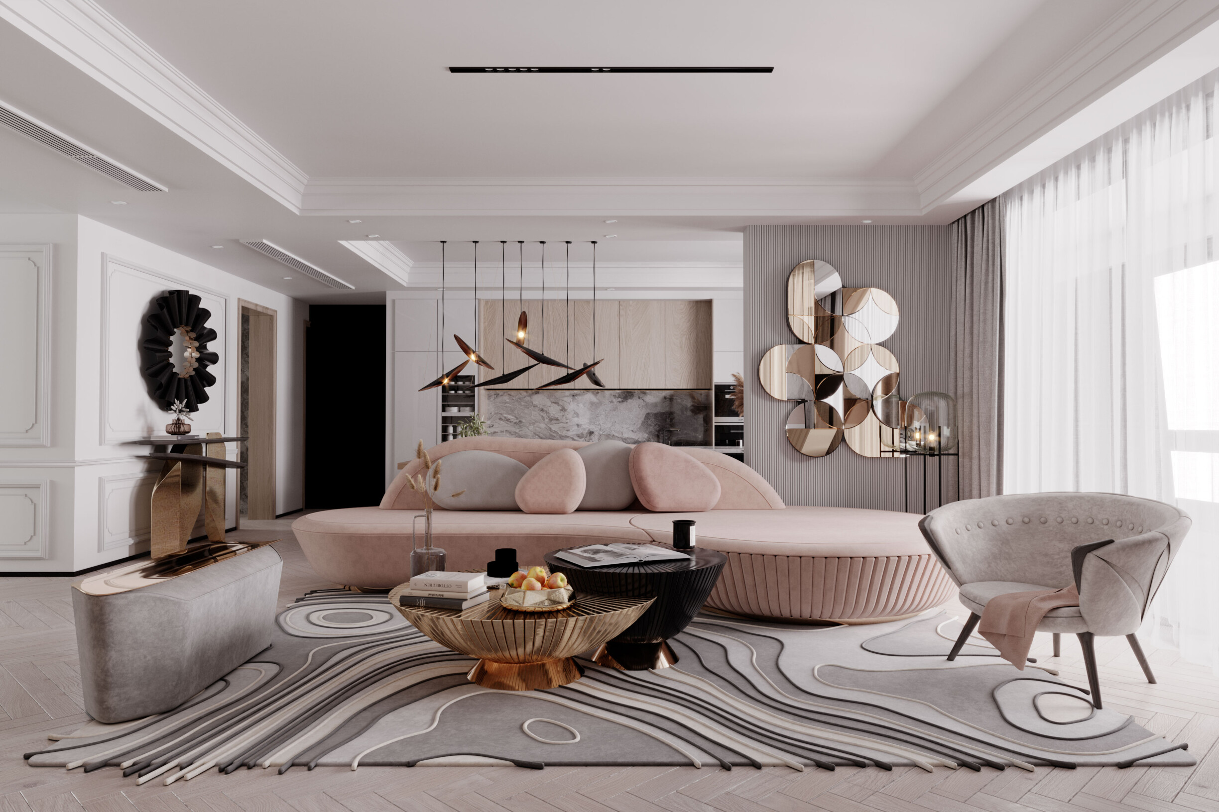
Effect: Lively (bubbly pink), calming (light pink);
Association:
Positive: Lively, calm, intimate;
Negative: Too sweet, weak;
Character: The architect or interior designer should use the pink colour carefully. The pink colour is usually considered feminine, but it depends a lot on the shade used (bubblegum pink or old rose);
Ceiling: Delicate, comfortable;
Walls: Inhibitors of aggression, intimate, very sweet if not greyish;
Flooring: Very delicate, not used very often;
Example: Pink living room inspiration by Alma de Luce
Effect: subjugating;
Association:
Positive: Warm, safe, stable;
Negative: Oppressive, heavy;
Character: There is a big difference between wood and brown paint. In certain institutions, Architects or interior designers should avoid brown as it evokes faecal associations. Wood and stone, on the other hand, feel very comfortable and warm;
Ceiling: Oppressive and heavy (if dark);
Walls: Safety and using wood produce a powerful combination;
Floor: Stable, warm;
Example: House Lote 04, Guimarães, Portugal. It uses brown colour on the outer cladding. See here how wonderfully the shale stone matches this tone. Project ObraAtelier.
Effect: Baffling;
Association:
Positive: Clean, crisp, bright;
Negative: Empty, sterile;
Character: There are many psychological and physiological justifications for not using white as the dominant colour. However, it is the colour that best highlights the others when they are punctual;
Ceiling: Empty, no design objections – helps diffuse light sources and reduce shadows;
Walls: Neutral to empty, sterile, without energy. It helps to spread light;
Floor: Touch inhibitor (must not be walked on);
Example: It uses white in contrast to darker colours, which enhances and creates a depth of the plans, valuing the Open-space. We can see how the wood plans stand out with the white colour. Project Alma de Luce
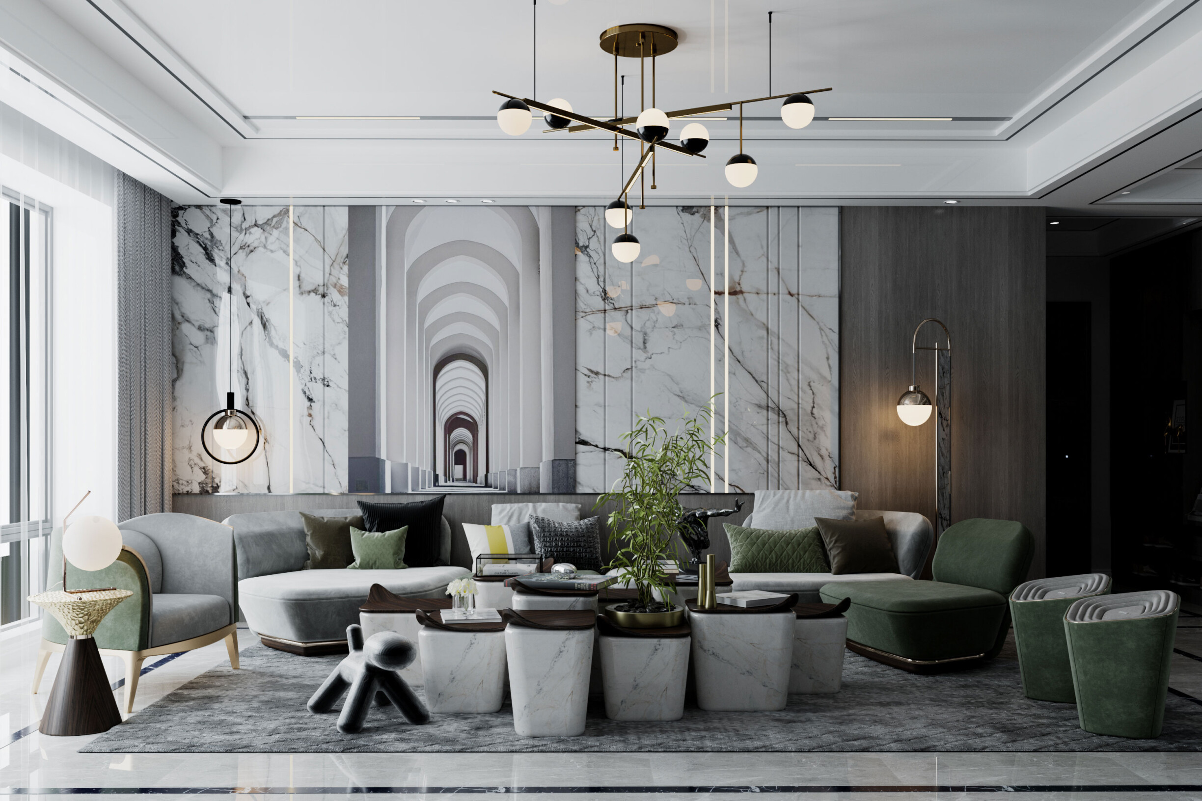
Effect: Neutral to soothing;
Association:
Positive: Neutral;
Negative: Boring;
Character: Gray does not have much psychotherapeutic application. It is an annoying colour if it is not applied to materials that create contrast and games of light and shadow;
Ceiling: Shaded;
Walls: Neutral to flat;
Floor: Neutral;
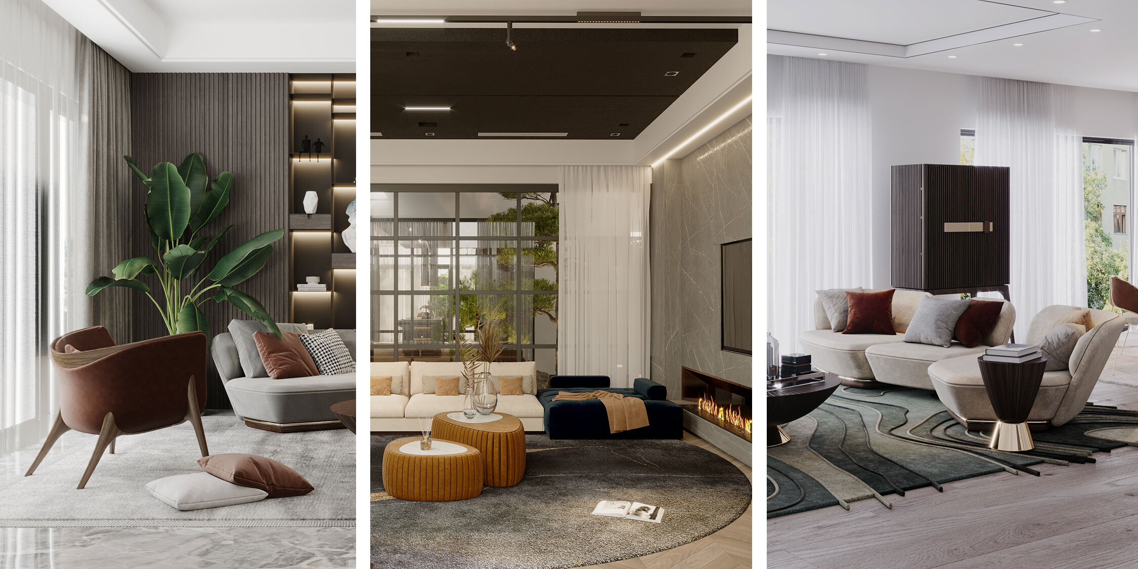
Example: The living room for the penthouse uses a grey colour on various materials. The grey colour highlight and favours the project, giving it a modern look. Project by Alma de Luce.
Effect: Sinister;
Association:
Positive: Deep, abstract;
Negative: Dungeons, night, sadness, death;
Character: Black is associated with oppressive power, darkness and the unknown. In architecture, the professionals use grey colour often to make the volume appear to be set back or to highlight other colours;
Ceiling: Hollow for oppressor;
Walls: Sinister, similar to a dungeon;
Floor: Strange, abstract;
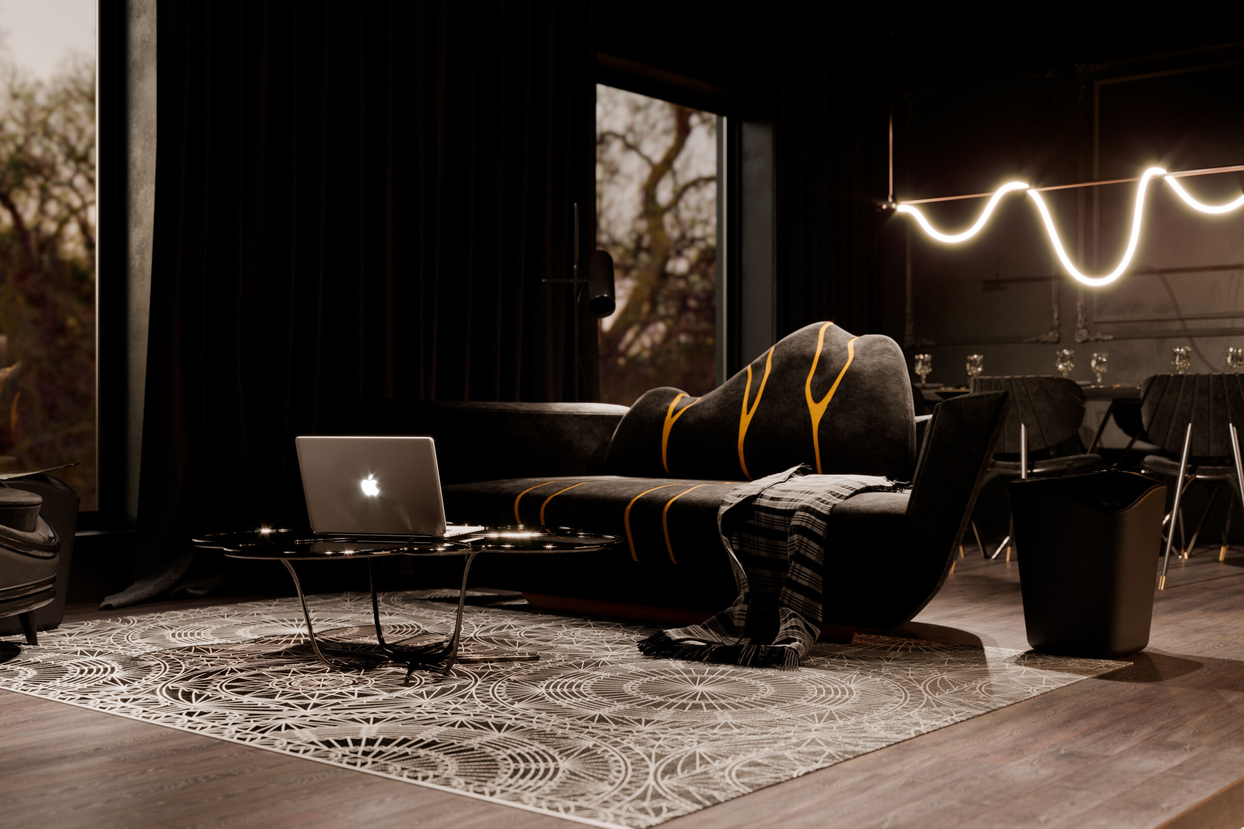
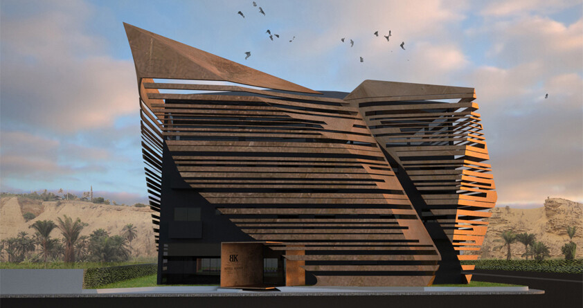
Example: Hotel BK, Angola. It uses a black background to highlight the metallic coating material. The black colour in this design gives it a glamorous and contemporary touch. Project Obra Atelier.
We realize that colour has enormous emotional power both in architectural interiors and exteriors. When designing with colour, even something as simple or familiar as black and white, due consideration of lighting, material, and design is also critical.
The architect or interior designer must consider the colour effect of each element of a building's construction, from the earthy colours of primary building materials such as wood, stone, brick and marble, to the wide variety of colours available for paint, doors, windows, coatings and trim. With each colour often connoting a range of emotions, from the happiest to the most sinister, only a cohesive, holistic architecture or design can ensure that colour produces the intended effect.
Want to know more? Do you have any doubts about introducing colour furniture in your projects? Talk to us... together with our technical team of architects and designers, we help you choose the best options for stunning and contemporary colour projects. Come find out! Consult us and learn more. 🙂