Choosing between a dark or light design isn't a decision based on taste or preference. It's a strategic choice that will fundamentally alter how people inhabit, perceive, and interact with a space. For interior designers, this choice raises essential questions:
How do you create the right atmosphere?
How do you control light, visual volume, or the feeling of comfort?
And, above all, how do you convey a client's or brand's identity through colour?
Light design and dark design are distinct approaches with deep roots in design history and colour psychology.
Light design, associated with lightness, spaciousness, and luminosity, relies on soft, neutral palettes and is strongly influenced by Scandinavian minimalism and modernism. Dark design, on the other hand, employs intense, deep tones to create denser, more dramatic, and sophisticated atmospheres, drawing inspiration from industrial, classic, and contemporary styles.
In this article, we'll analyse the main characteristics of each approach, the emotional and functional impact of the colour palette, when it's sensible to choose one over the other, and whether it's possible to combine both in an intentional visual balance. The right contrast often embodies true elegance in design.
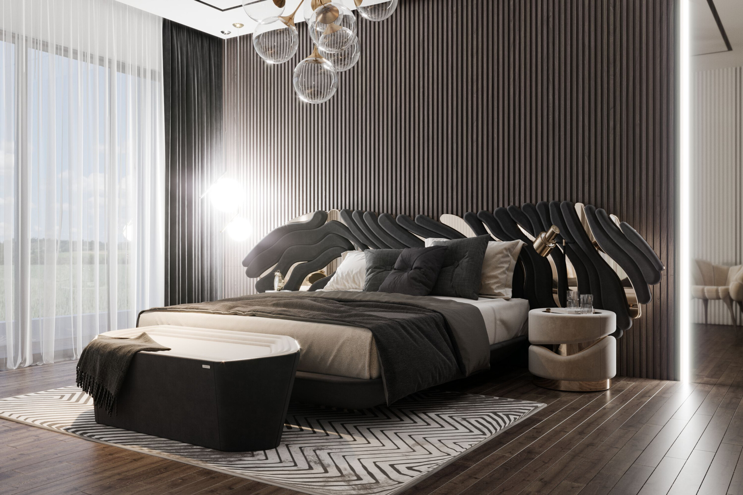
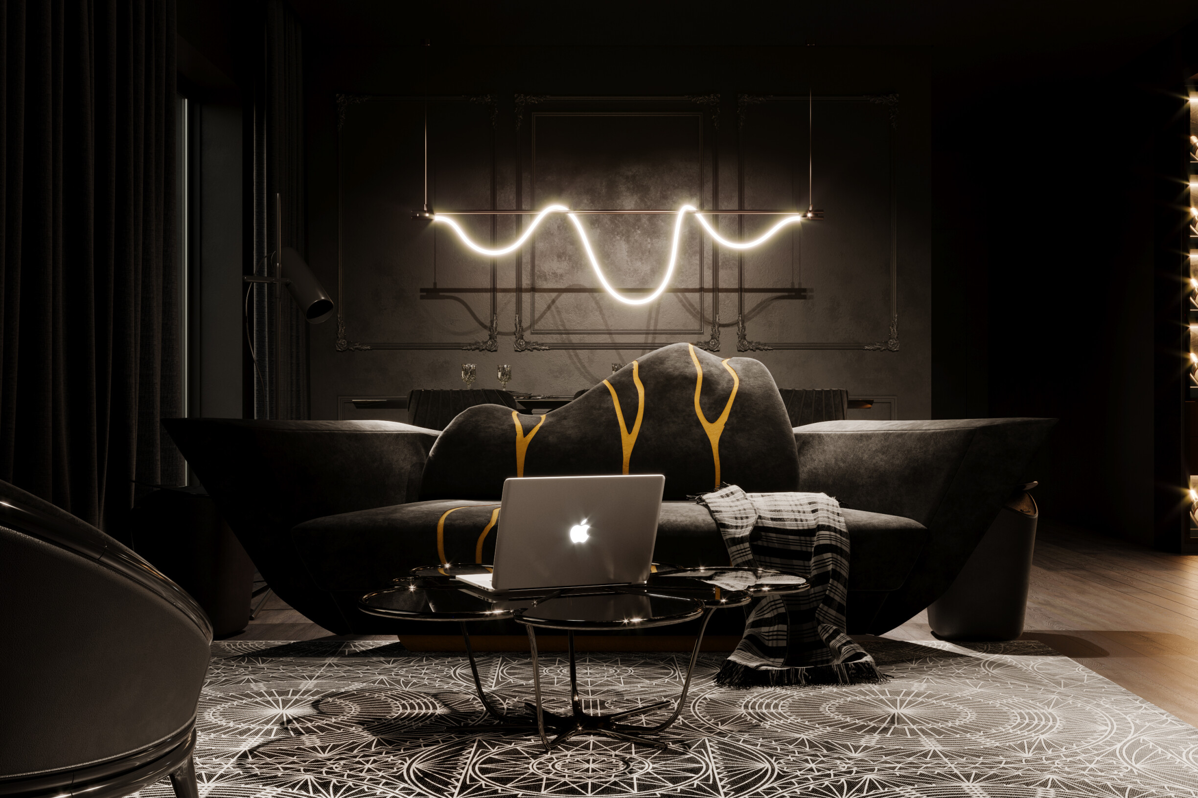
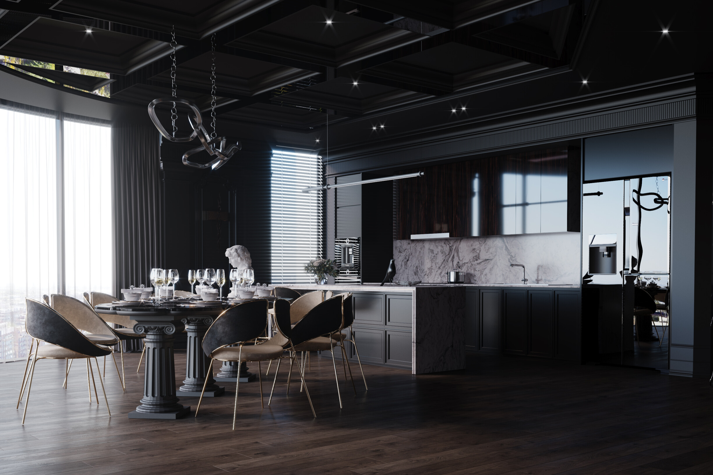
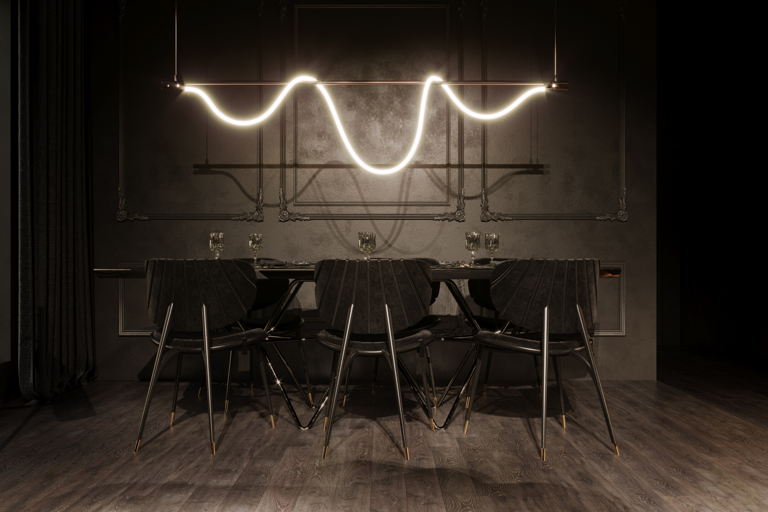
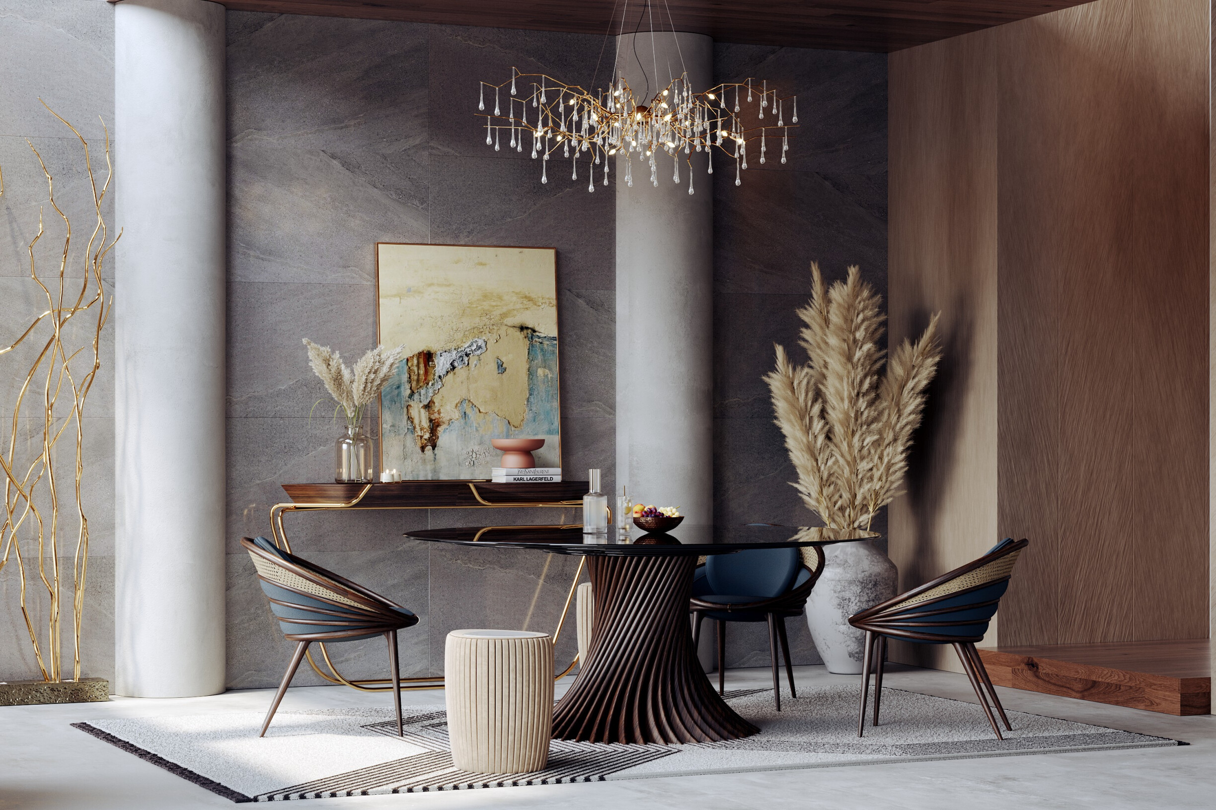
Dark design is characterised by its predominant use of intense, deep hues that give interiors a sophisticated, captivating, and often dramatic atmosphere. This approach relies on colours such as black, anthracite grey, petroleum blue, moss green, dark brown, Wine Red, and other rich hues that create spaces with strong personality and character.
Among its main features, the following stand out:
1. Depth and visual intensity
Dark colours absorb light, making spaces feel denser and more intimate. This effect is ideal for rooms such as living rooms, libraries, or bedrooms, where you want to develop a sense of comfort and seclusion. For example, using a moss green wall paired with dark wood furniture creates a natural and welcoming elegance.
2. Sophistication and drama
Dark design evokes luxury and exclusivity, common in contemporary interiors that aim to convey refinement. A classic example is the use of matte black walls in dining rooms, paired with thoughtful lighting that highlights decorative pieces and creates striking focal points.
3. Emphasising textures and materials
In dark spaces, textures take centre stage, balancing the impact of colours. Materials like velvet, leather, black marble, and gold or chrome metals intensify the feeling of depth and luxury. For example, in a dark space, a sofa like the Dom Sebastião by ALMA de LUCE becomes an irresistible centrepiece.
4. Contrast and focus
Dark design allows light elements to stand out, whether artwork, decorative pieces, or architectural details. This relationship creates visual balance and helps guide the eye within the space.
5. Timelessness with a contemporary touch
Although often associated with classic or industrial styles, dark design has been reinventing itself by incorporating minimalist and technological solutions that keep it current and relevant.
Despite its advantages, dark design requires an appreciation of the psychology of lighting and spatial distribution to avoid overly heavy or claustrophobic spaces, a mistake every designer should avoid. When applied well, it creates elegant, cosy, and personality-filled spaces, perfect for clients seeking a balance of boldness and comfort. An effective way to balance these proportions is to apply the 60-30-10 rule to space planning, a classic interior design technique that helps harmoniously distribute primary, secondary, and accent colours.
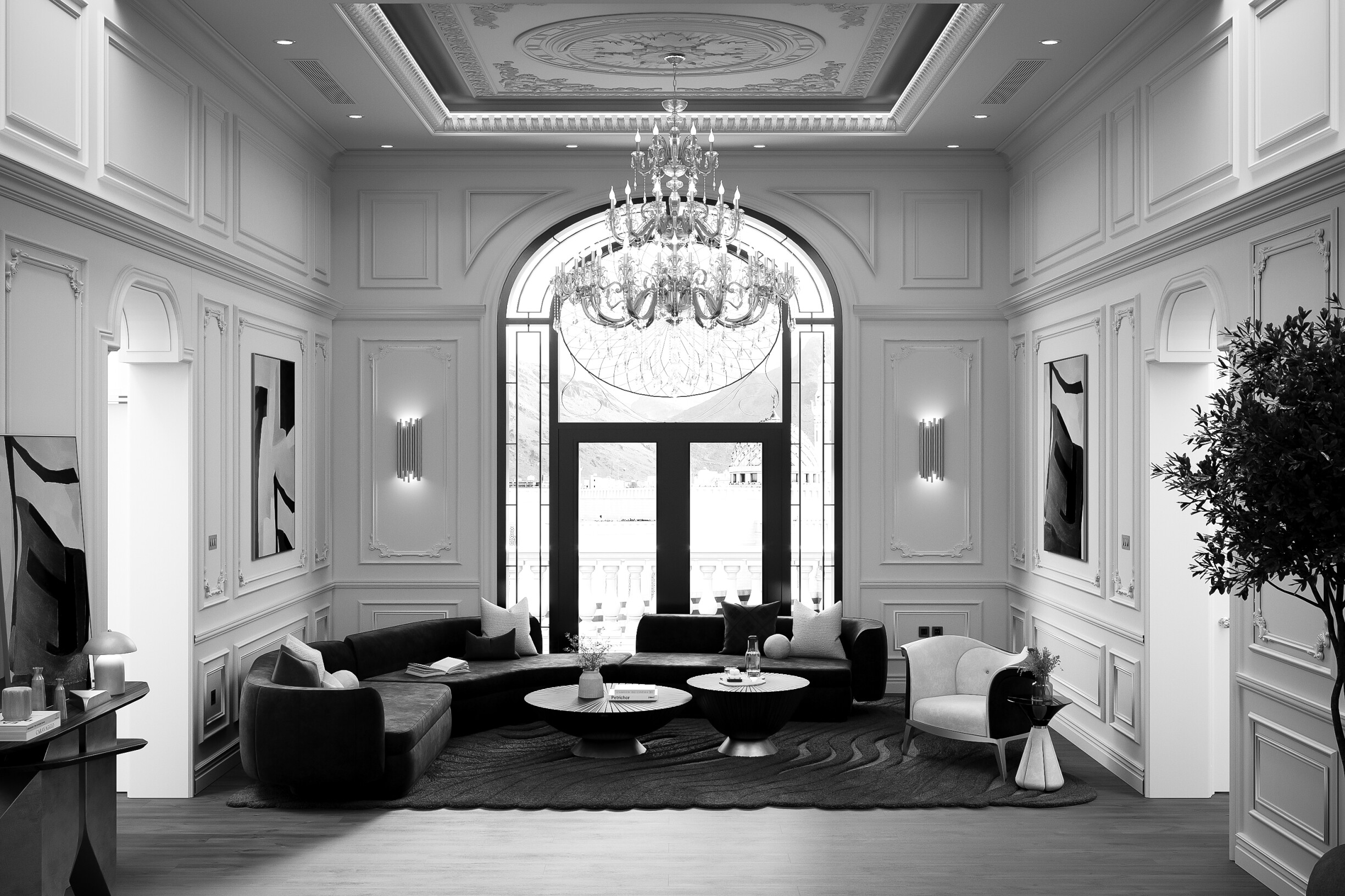
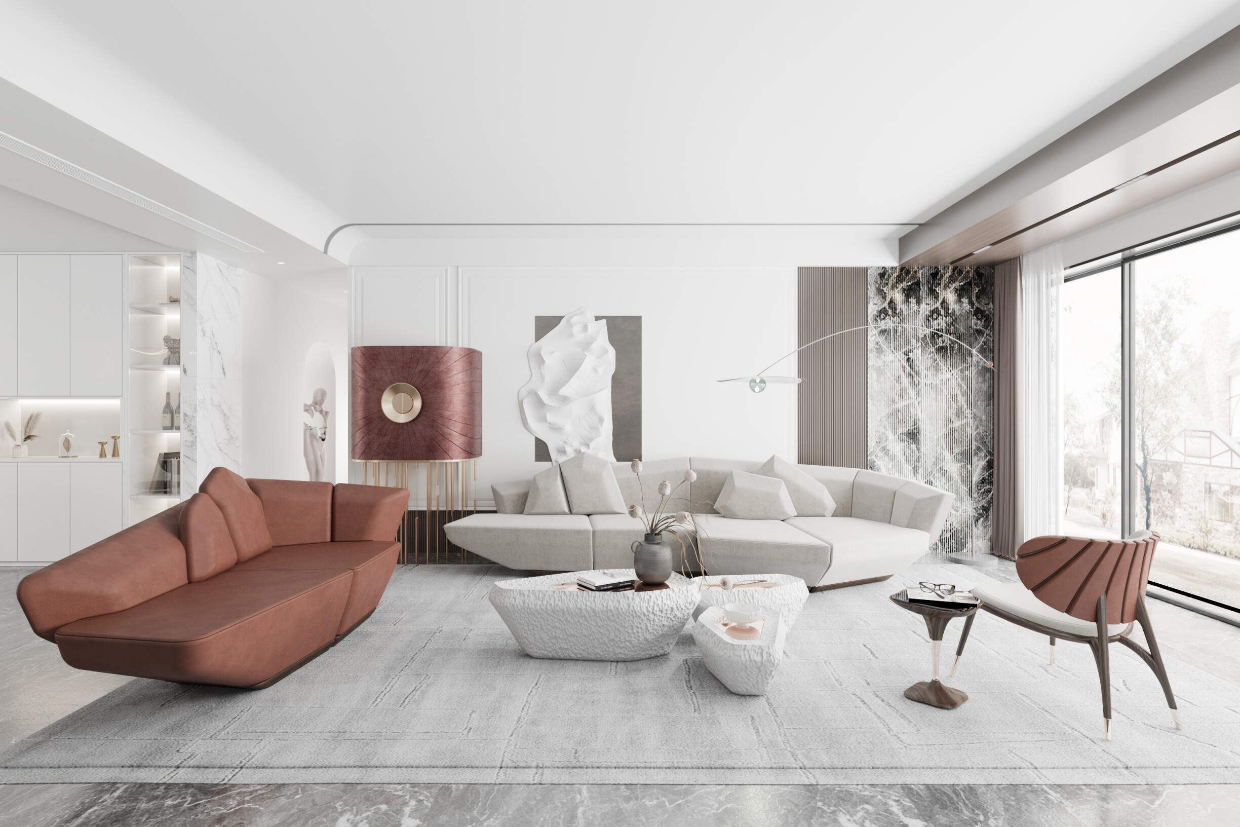
Light design is characterised by the predominance of soft, bright tones that visually expand spaces and convey a sense of lightness, serenity, and freshness. Its colour base includes whites, beiges, light greys, sand tones, and pastels, creating welcoming, balanced, and visually clean atmospheres.
Among its main features, the following stand out:
1. Sense of spaciousness and light
Light colours reflect natural light, making spaces feel bright and visually spacious. This effect is particularly effective in small spaces or those with limited sunlight. For example, a room clad in warm white, with large windows and light wood accents, gains dimension and a sense of lightness.
2. A tranquil and airy room
Light design is associated with well-being, visual silence, and organisation. It is a frequent choice in Scandinavian, minimalist, or Japandi-inspired projects, where the goal is to create spaces that promote calm and functionality. Bedrooms, reading areas, or offices particularly benefit from this type of atmosphere.
3. Harmonious integration of natural materials
Textiles such as raw linen, washed cotton, and jute rugs, as well as light woods like oak or birch and matte ceramics, all reinforce the natural and organic aesthetic. This material language brings the space closer to emotional comfort and authenticity. A classic example is a kitchen with sand-toned cabinets, light stone countertops, and simple yet highly sophisticated natural wood accessories.
4. A neutral base for contrast and personalisation
Despite its softness, the design’s lightness allows furniture, artwork, or decorative details to stand out with colour or texture. This neutrality is also advantageous for those who want to evolve the space over time, allowing for easy changes to elements.
5. Versatility and timelessness
Because it's understated and balanced, the light design adapts to various styles, from rustic to contemporary. Furthermore, it remains timeless and resistant to changing trends. Overuse, though, can make a space boring or impersonal. To prevent this, incorporating subtle contrasts, warm lighting, or textured details can significantly enhance the overall aesthetic.
Still, decorating white spaces requires attention to detail to avoid cold or impersonal areas. Knowing how to work with different textures, materials, and pops of colour is essential for achieving sophistication.
The choice between a dark or light design should be made based on multiple factors, including the functionality of the space, available natural light, desired style, and the emotional response you want to evoke in users.
Spacious spaces with plenty of natural light: spaces with generous windows and favourable solar orientation benefit from the visual depth that dark tones offer, without becoming claustrophobic.
Spaces where intimacy is sought, such as reading rooms, bedrooms, or formal dining rooms, benefit from a sense of shelter and sophistication.
Projects with a strong scenographic or impactful component, such as boutique hotels, showrooms, luxurious commercial spaces, or high-end residences, can utilise a dark design to convey exclusivity and a striking identity.
Small spaces or areas with limited natural light, such as compact kitchens, bathrooms, or hallways, can gain a sense of openness with light palettes.
Functional and practical spaces, such as offices, home offices, kitchens, and hallways, benefit from the lightness and neutrality of light design.
Styles that require simplicity and lightness, such as minimalism, Scandinavian, or modern Mediterranean, need light, soft, and uncomplicated tones.
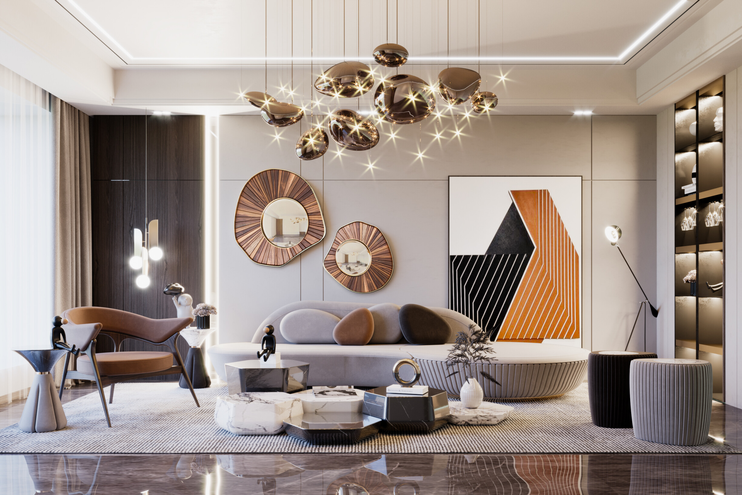
Combining light and dark elements in the same space can be the best solution. It creates contrast, defines distinct zones, and adds sophistication without compromising brightness. The key is visual balance, following these 4 practical tips:
Combine light walls with dark furniture to create depth without weighing down the space.
Use dark tones for details, such as doors, metal structures, or curtains, to create visual anchor points.
Invest in different colours to visually separate areas with other functions within the same open space, eliminating the need for walls or dividers.
Use lighting strategically, using direct light on dark elements to enhance their presence and avoid visually saturated areas.
The result? A dynamic, elegant, and distinctive space that combines the best of both worlds.
Choosing between dark and light design isn't merely an aesthetic decision but a strategic one that must respond to the needs, functionality, and emotions each space aims to evoke. A dark space can convey introspection, sophistication, and strength. A light space, on the other hand, inspires lightness, spaciousness, and serenity.
More than opposites, these two styles can coexist in a complementary way, creating contrasts that enhance each element and add depth to the project. The key is to understand the intention of the space, the client's profile, and the language you want to convey.
Need inspiration for dark or light design in your projects? Check out some inspirations on Alma de Luce's Pinterest that best suit your needs or your client's desires. Once you've found inspiration, do you want some help getting started? Contact us here😉