In interior design, choosing colour palettes is one of the fundamental pillars for creating sophisticated interiors that are visually harmonious and emotionally welcoming. In addition to applying colour theory, it is crucial to understand how to translate this knowledge into practical decisions that enhance each space.
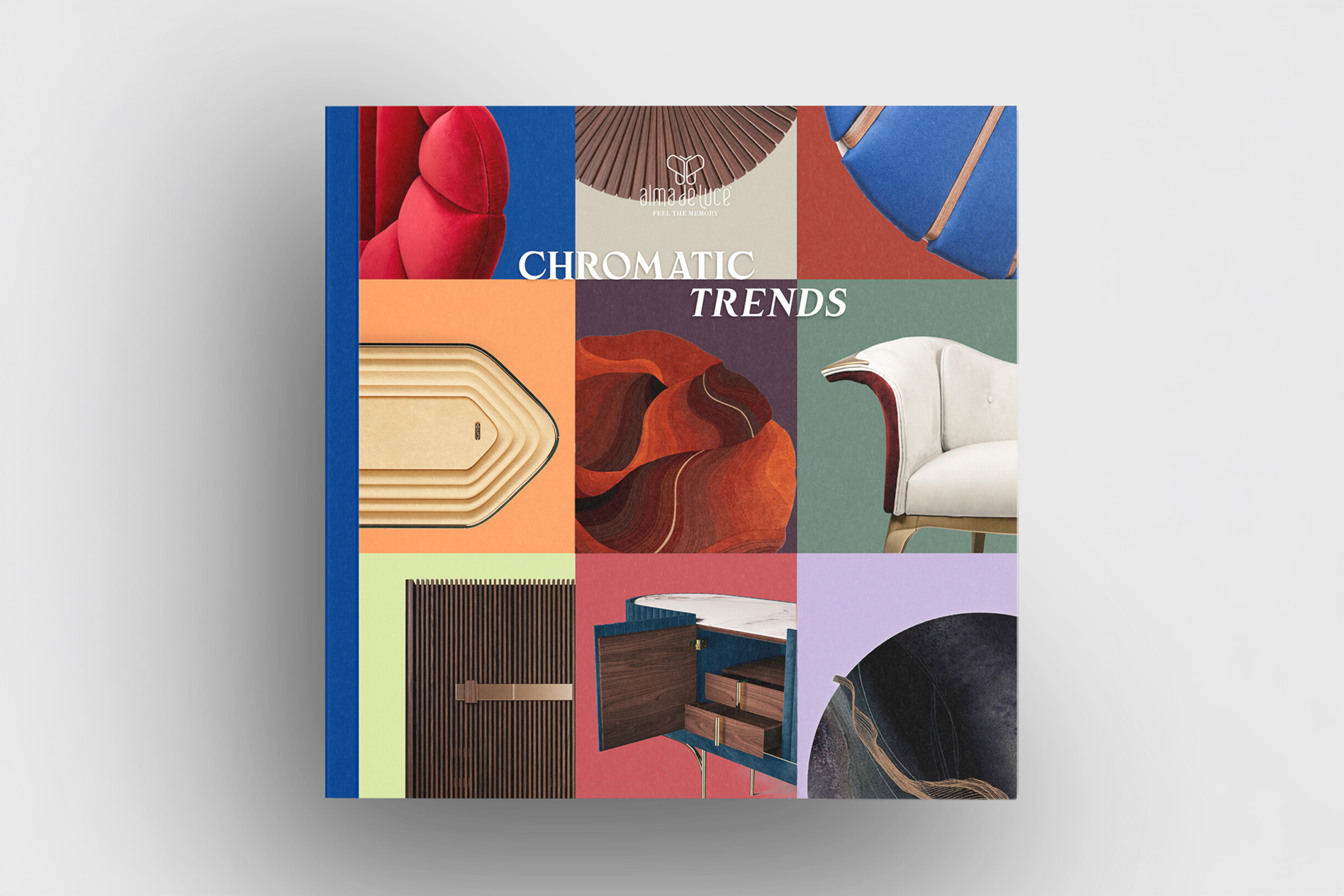
This article guides professionals, including architects, decorators, and designers, in creating elegant colour combinations that integrate science, aesthetic sensitivity, and functionality. To support this approach, ALMA de LUCE's Chromatic Trends Design Book continues to be a solid reference. Each tone tells a story, and each space is transformed into a masterpiece of style and sophistication, following current market trends.
Colour theory in interior design is often simplified, but you must go far beyond the colour wheel and basic combinations to create exquisite colour palettes.
First, it is important to understand that colours do not exist in isolation. The light, materials, and textures present in the space influence the hue. Therefore, it is essential to know how to adjust the value (luminosity) and saturation (intensity) of colours. Vibrant tones, if used without control, can easily lose elegance; on the other hand, nuanced tones, such as greyish pastels or blurred versions of intense colours, create rich and subtle nuances that enrich the visual experience.
Another dimension that is little explored is the influence of colour temperature in conjunction with artificial lighting, which can dramatically alter the impact of the colour palette. Innovative projects combine cool tones with warm light or vice versa to create sensory contrasts that reinforce the comfort and depth of the space.
In addition to traditional complementary and analogous colours, it may be essential to explore triadic and tetradic harmonies, which involve three or four points on the colour wheel, and to create more complex and dynamic compositions. These formulas require a trained eye and careful application, using neutrals or tonal variations to avoid visual overload, but can result in surprisingly sophisticated and contemporary colour combinations.
Finally, experimenting with colour saturation and transparency, using techniques such as glazes and overlays on different materials, adds a tactile and visual dimension that elevates any project to a level of exclusivity and personality, and this is the true essence of sophisticated interiors.

Making the strategic decision to choose the right colour palette in the early stages of the project is crucial. Colour is the space's foundation and can affect users' views of space, function, and mood.
First of all, it is important to answer some essential questions:
1. What is the purpose of the space?
2. What identity or message does the project want to convey?
3. What emotions do we want to provoke?
These responses help define the colour direction and ensure consistency throughout the design. Using ALMA de LUCE's Chromatic Trends Design Book as a starting point can be beneficial, as it presents colour palettes that align with contemporary trends while maintaining a timeless elegance.
The 60-30-10 rule is a well-established guideline for achieving harmony:
60% dominant colour (usually neutrals, to create balance)
30% secondary colour (which complements and adds depth)
10% accent colour (for impact and visual interest)
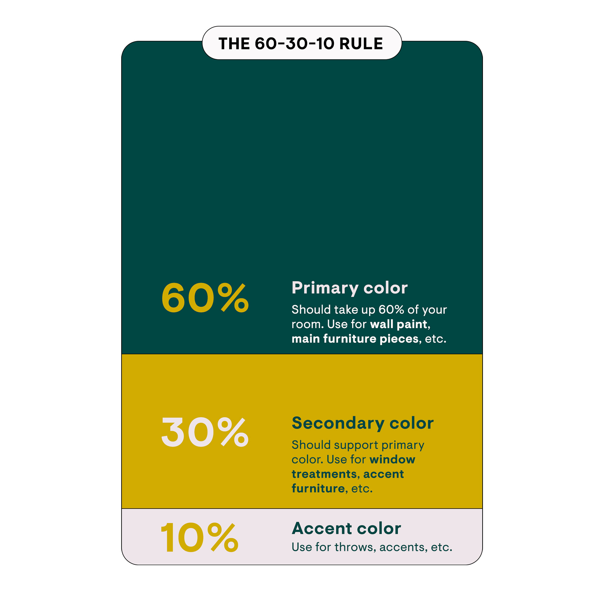
This formula allows you to create balanced and sophisticated colour combinations that work in any space, from residential to commercial. It is also a simple way to manage the complexity of the palette without losing elegance.
In addition, the decision should consider the use of colour in furniture, coverings, accessories, and lighting. This will reinforce the space's coherence and sensory experience, aligning with the concept of sensory design that transforms interiors into memorable experiences.
In interior design, colours are powerful tools for shaping people's emotional and spatial experiences. Understanding colour psychology enlightens us about how different hues influence our mood, energy, and perception of space, inspiring us to create more impactful designs.
“Colour is a power which directly influences the soul."
Wassily Kandinsky, a Russian painter and art theorist
For example, blue is a colour associated with calmness and serenity. In a bedroom or workspace, blue helps promote concentration and relaxation. Green, which reminds us of nature, brings freshness and balance, working very well in living rooms and areas where you want a revitalising room.
On the other hand, warm colours like red and orange are stimulating and energetic. Using them in kitchens or living rooms can encourage communication and dynamism. However, care must be taken: these colours can cause agitation or discomfort when overdone.
The color's temperature (warm or cool) also affects its perception of space. Cool shades tend to recede visually, making a room seem more spacious. Warm colours, on the other hand, advance, creating a feeling of closeness and cosiness. Therefore, using cool tones in small spaces can help expand perception, while warm colours work better in large rooms that need to be welcoming.
Saturation and brightness are other essential factors. Highly saturated colours are more intense and can dominate a space, so it is common to combine them with neutral tones to maintain balance. Light, low-saturated colours promote lightness and fluidity, essential for maintaining elegance.
Furthermore, the strategic use of colours can define specific areas within the space, such as highlighting a wall or creating focal points that guide the user's gaze and enhance functionality.
Integrating these principles with sensory design, which focuses on creating areas that engage all the senses, allows us to create interiors that are not only visually sophisticated but also complete in terms of experience and comfort. This approach considers not only the visual impact of colour but also how it can influence the overall feel and functionality of a space.
Creating elegant colour palettes requires more than choosing pretty colours; it also requires practical strategies that allow you to harmoniously apply these colours to furniture and details in your space. Here are some essential tips for those who want sophisticated and consistent results.
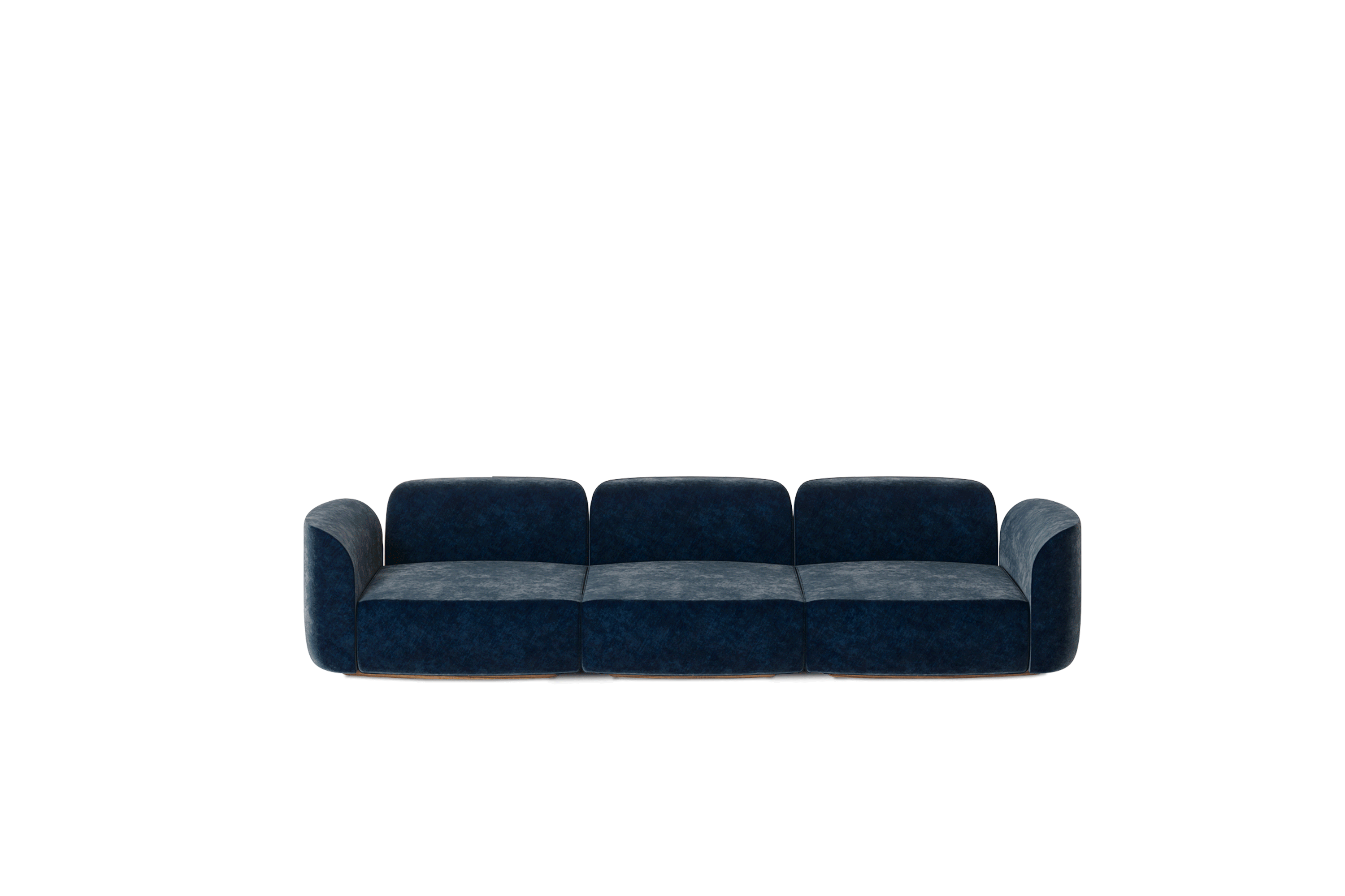
A sofa, iconic chair, or coffee table with a striking colour or finish can be the focal point of the palette. For example, the Marqueyssac sofa from ALMA de LUCE serves as a base for combining neutral and metallic accessories, creating a rich and balanced contrast.
Light wood tables, beige or grey chairs, and neutral rugs are essential allies to soften the composition and prevent the space from becoming too saturated or heavy. Neutral colours help maintain elegance, even when strong colours are used in other pieces.
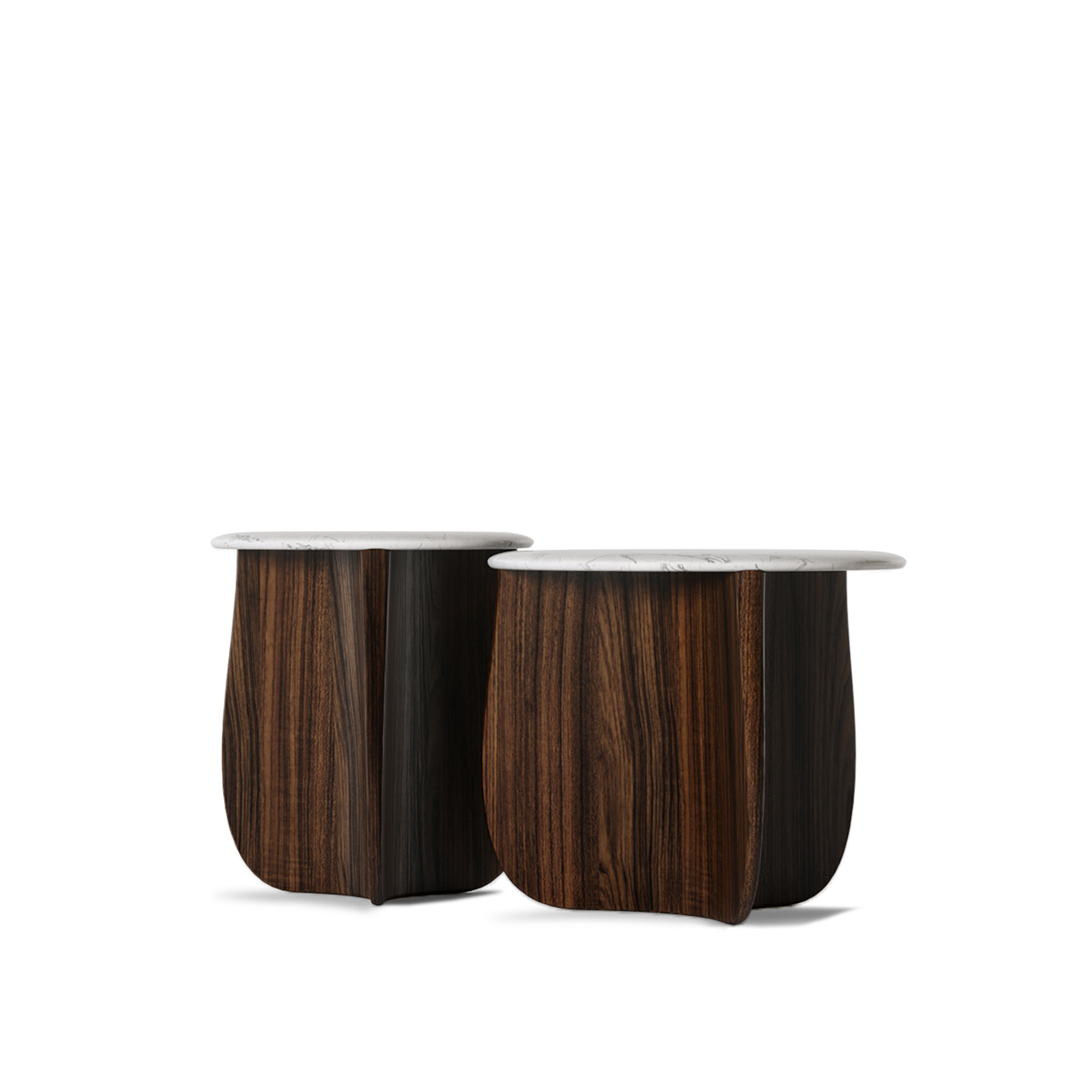
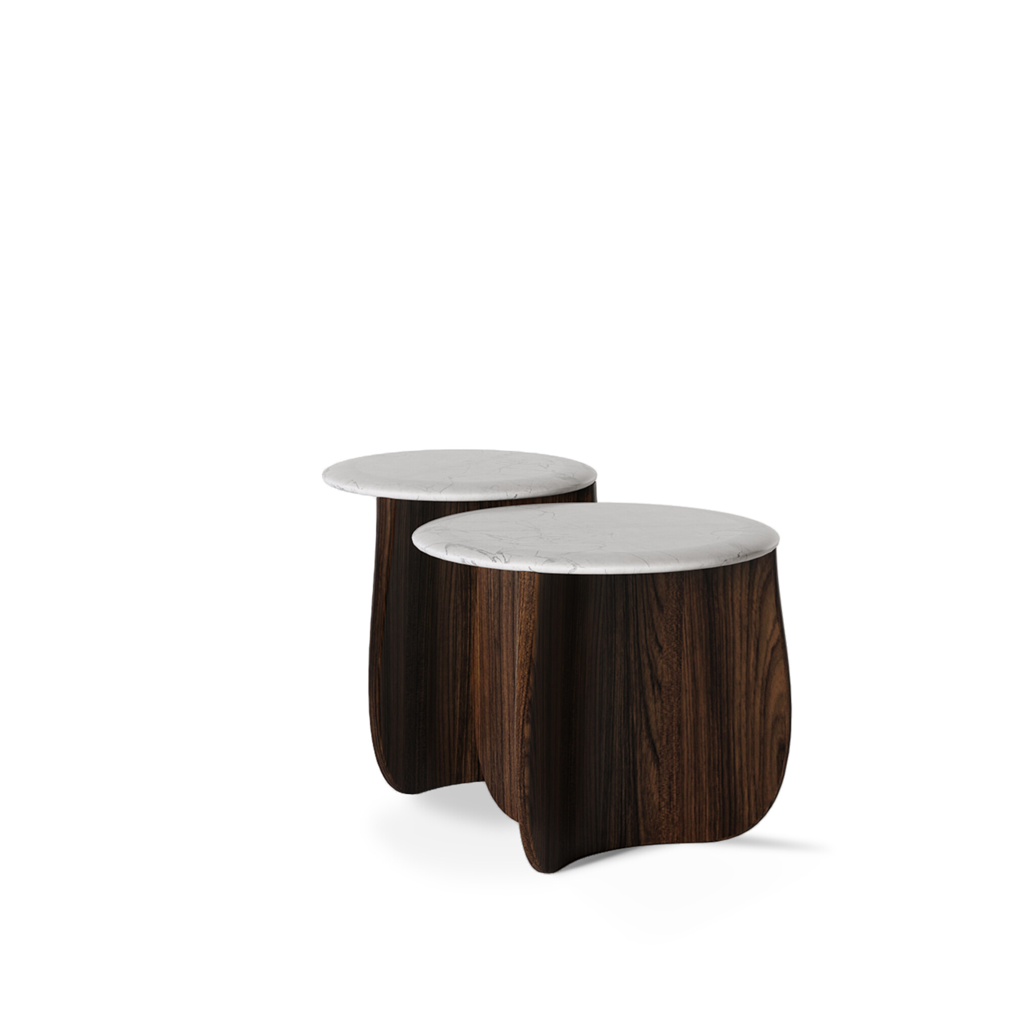
It's not just the colour that counts. Different textures, such as natural wood, matte metal, glossy glass, and soft fabrics, add dimension and sophistication. A side table with a table top in Estremoz marble and a body in solid walnut wood, like the Roatan side table from ALMA de LUCE, creates visual and tactile interest, reinforcing the chromatic harmony.
The 10% palette rule can apply to accessories like pillows, lamps, or artwork. A set of warm-toned pillows in a neutral-based room adds energy and personality without overwhelming the space.
Large pieces should be in more neutral or calm colours so as not to dominate the space. The smaller pieces are ideal for vibrant colours or bold textures, making it easier to make future adjustments without too much structural impact.
Mastering the art of colour palettes is a decisive step towards creating sophisticated interiors that impress and excite. From the conscious choice of colours to the strategic application of furniture and details, each decision creates a unique space full of personalities.
The future of design depends on having the courage to experiment with precision in choosing and combining colours. Now is the time for you to bring your ideas to life with palettes that tell stories, provoke sensations, and redefine luxury. How? We help you take the first step by inviting you to visit ALMA de LUCE's Pinterest to discover inspirations that best suit your needs, your tastes, or your client's desires.
We will help you create exclusive and current projects that win over your customers with these trends.