In 2026, trend colours will establish themselves as a structural language in interior design, leaving behind the merely decorative role they have occupied for decades. After a period marked by rapid visual stimuli and colour choices orientated towards immediate impact, the sector enters a phase of greater maturity. Colour is now thought out with intention, integrated from the genesis of the project, and aligned with emotional comfort, functionality, and identity. In the context of interior design in 2026, colour decisions will reflect behaviour, culture, and a new relationship with time and space.
This article proposes an in-depth reading of the main trending colours in interior design, explaining why they are in vogue, how they should be used, where they work best, and why it is essential to think of colour as a structuring language in interior design in 2026.
The trends in interior design in 2026 are directly linked to the way we live and use spaces. The home, work, leisure, and rest merge into hybrid environments that require smarter and more sensitive solutions. Colour accompanies this change and plays a strategic role in the creation of functional and user-friendly spaces.
Contemporary design today integrates concepts such as neuroarchitecture, which analyses the impact of the built environment on the brain and emotions. Colour influences rhythm, space perception, and emotional states, becoming an essential tool for creating balanced environments. This emphasis is joined by a growing attention to ergonomics in interior design, where physical comfort and visual comfort go hand in hand.
Sensory design assumes a central role, considering both the visible and tactile senses. Colour works together with texture, light, sound, and materiality, creating complete spatial experiences. In this process, the influence of nature becomes one of the main sources of inspiration, reflected in organic palettes, earthy tones, and serene greens.
In parallel, contemporary design seeks to combine tradition and modernity, recovering classic references and reinterpreting them in a contemporary way. This approach moves away from excessive decoration and leans towards a more restrained, yet deeply expressive, aesthetic.

The colours that define 2026 do not work alone. They are conceived as coherent chromatic systems, capable of adapting to different scales and typologies. This logic reinforces the role of colour as a structural element in trend colours for interior design, fundamental in both residential projects and in hospitality or commercial spaces.
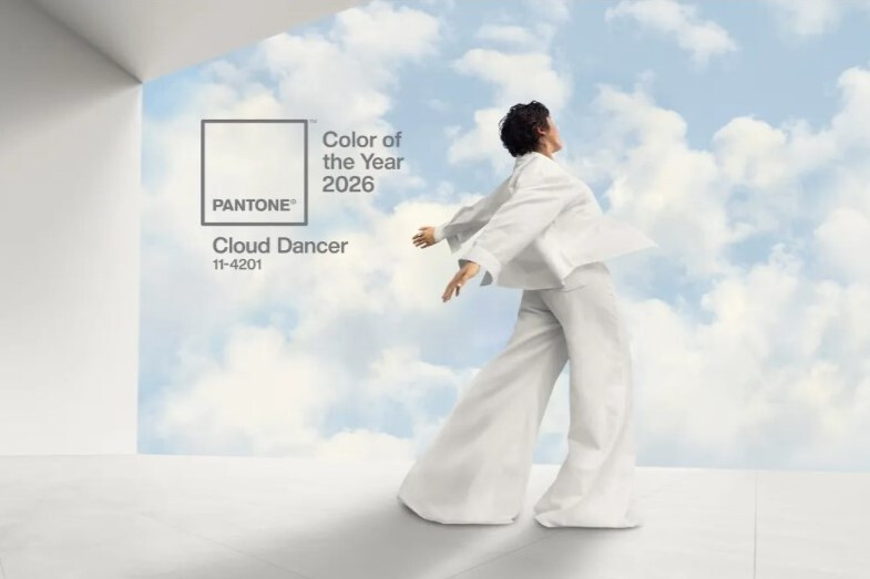
Pantone has defined Cloud Dancer as the colour of 2026, validating a clear trend towards light, soft, and subtle tones. This sophisticated off-white represents clarity, balance, and visual restraint.
From the perspective of colour psychology, it conveys mental pauses and emotional stability. It reduces sensory overload and creates a sense of order and continuity, being particularly effective in complex or multifunctional spaces. As a chromatic base, it amplifies natural light and enhances proportions, serving as a backdrop for design cabinets, designer armchairs, and signature furniture pieces, such as the Naruto armchair, without competing with them.
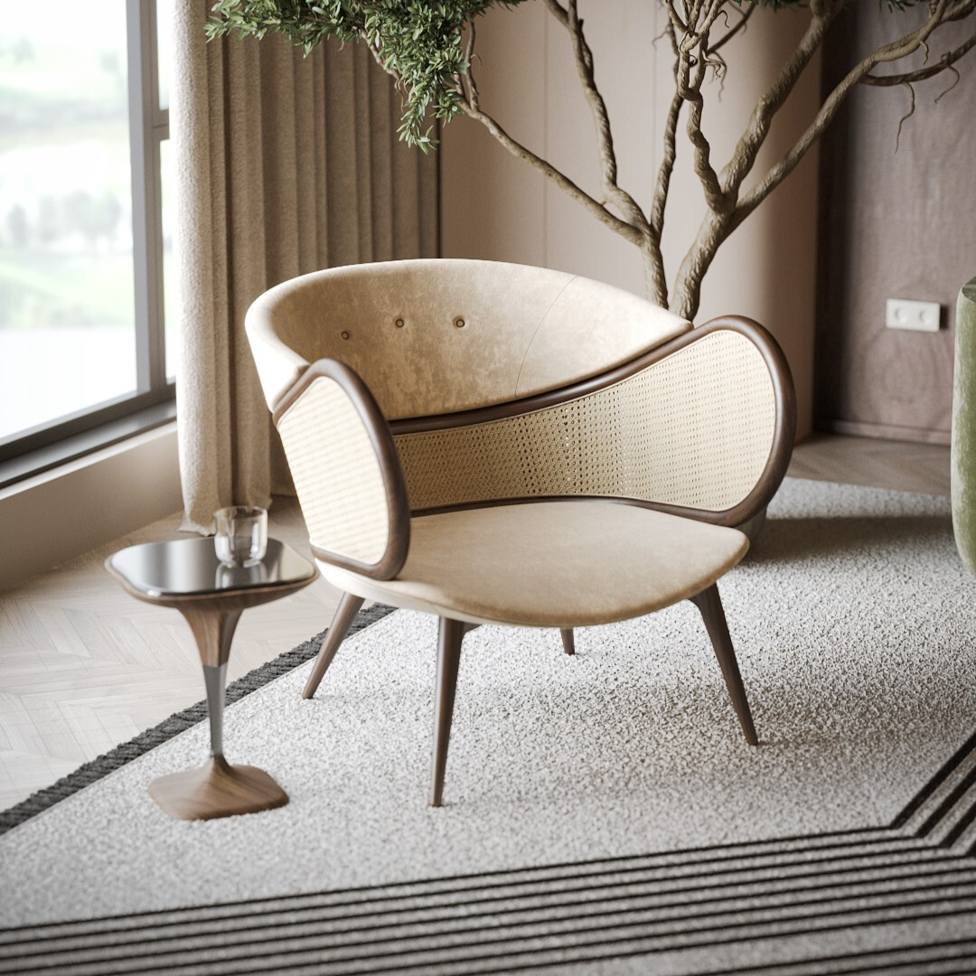
Beige returns in 2026 with a more human and tactile interpretation. Far from cold and impersonal neutrals, it presents itself with subtle warm variations that introduce comfort and closeness.
In terms of colour psychology, it is associated with safety, warmth, and emotional stability. It promotes relaxation and a sense of belonging, making it ideal for long-term stay environments. This tone facilitates the creation of elegant colour palettes, favours chromatic and material layering, and allows for the natural application of the 60-30-10 rule in interior design. Together with luxury textiles, it contributes to sophisticated and balanced interiors.
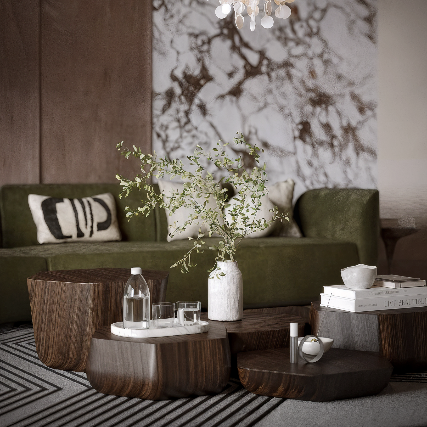
Greens remain central in the 2026 trends, but with a more refined and less decorative approach. Inspired by vegetation, they reinforce the connection to the outdoors and the natural world.
Psychologically, green is associated with regeneration, balance, and stress reduction. It acts as a mediator between stimulation and rest, and it is one of the most effective colours for promoting emotional well-being. In 2026, these greens are essential in projects that explore a second level of sensory design, creating serene, healthy, and visually stable environments, both in residential and professional spaces.
Terracottas, clays, and ochres assert themselves as character colours in 2026. They represent a conscious search for authenticity, memory, and connection to the earth.
Earthy tones convey grounding, truth, and emotional security. They create immersive and welcoming spaces, associated with permanence and identity. They are particularly effective in projects that explore sculptural design and value the dialogue between symmetry and asymmetry in interior design. These colours reinforce the power of storytelling by connecting the space with cultural and ancestral references.
Deep teal emerges as an introspective and sophisticated colour that is associated with concentration and mental balance. In 2026, it is used with restraint and intention.
It promotes calmness, focus, and confidence, helping to slow down the mental pace without creating emotional detachment. It is particularly suitable for spaces of contemplation, work, or reading, contributing to stable and quiet environments. Its chromatic depth allows for creating contrast without aggressiveness, enriching spatial perception.
Dark neutrals return with a warmer and more enveloping hue. Tones close to softened graphite, deep brown, or warm charcoal create elegant and structured settings.
They convey protection, introspection, and a sense of shelter. They help define spatial boundaries and create more intimate environments without losing sophistication. In 2026 they will be used to structure volumes, frame materials, and occasionally add depth and visual richness.
In 2026, chromatic energy manifests itself in the details. Warm yellows and rust hues emerge as strategic accents, never as the dominant base.
These tones are associated with vitality, creativity, and emotional stimulation. When used judiciously, they activate focal points and introduce dynamism into the space. They are particularly effective in projects that explore maximalism in decor in a controlled manner, reinforcing identity without compromising overall balance.
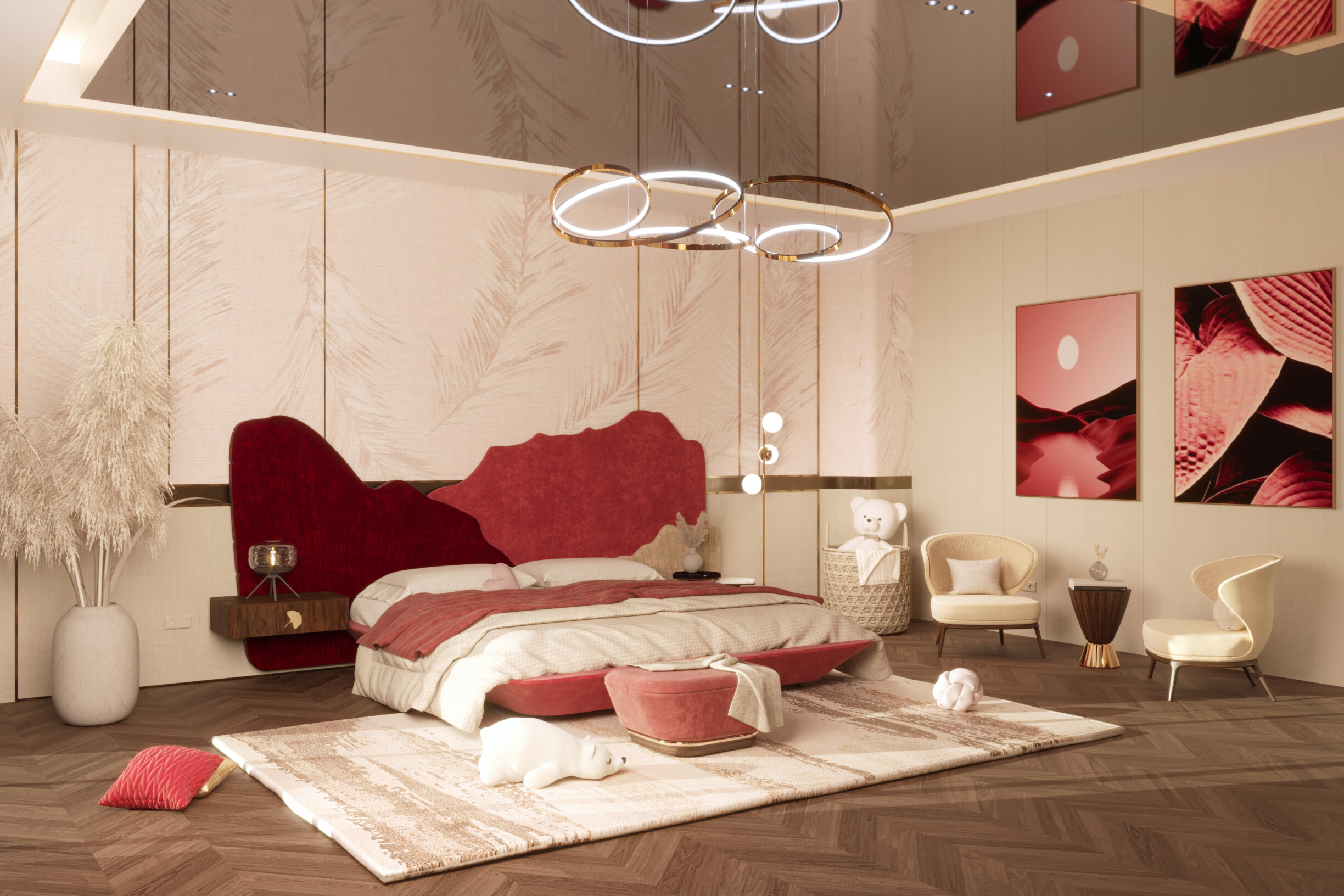
In this context, pieces with clear architectural language become natural supports for these accents. The Ginkgo Bed, by ALMA de LUCE, illustrates this approach by integrating warm chromatic accents into a rigorous and contemporary design, where geometry and materiality balance expressiveness and restraint.
Applying trends with discernment is one of the key skills of a successful interior designer. In 2026, following trends does not mean replicating formulas, but understanding context, function, and longevity.
The colour should be considered at the beginning of the project, in conjunction with materials, light, and the use of space. The creation of a consistent mood board remains an essential tool for testing chromatic relationships, textures, and proportions before the final execution. Successful projects avoid excesses and prioritise well-founded decisions that are aligned with the real daily life of those who inhabit the space.
In a scenario where colour asserts itself as a positioning rather than just an aesthetic choice, brands are taking on an increasingly authorial role. ALMA de LUCE has been following this evolution through its interpretation of colour as an identity element. In 2025, we highlighted Wine Red as our colour of the year, a deep and expressive shade that conveyed intensity and character. In continuation with this conscious approach, ALMA de LUCE is now preparing to launch its new trend colour later this month, reinforcing the idea that colour builds narrative, coherence, and legacy over time.
Thinking of colour as a language is indispensable to interior design in 2026. Trendy colours are deeply connected to values such as responsibility, inclusion, and environmental awareness.
The relationship between colour, shape, and proportion recovers classic concepts, reinterpreted in a contemporary logic of reinterpreting styles in design. Technology also plays a relevant role, allowing greater precision in the choice and application of colour, without replacing the human and curatorial eye.
Designing with colour in 2026 is designing with intention. It is to understand space as a living narrative, where each chromatic choice contributes to creating environments that endure, embrace, and communicate identity. To follow this reading throughout the year, inspirations continue beyond the text: on ALMA de LUCE's Instagram and Pinterest, it is possible to find visual references, pieces, and compositions that translate these chromatic trends into material and spatial language.
It is in this dialogue between thought, image, and material that contemporary design finds its future.