For an interior designer, often the challenge is not defining the decorative style, the appropriate pieces, or meeting what the client is looking for. The challenge is getting the colors right. They are a fundamental and inconstant element whose tones are so variable that they need to be used in the proper proportions. Otherwise, they risk destroying the entire harmony of a space.
From the color of the walls to the color of the furniture, even the textiles or small decorative details, colors define spaces, create sensations and feelings, value or destroy the light, and attract or push us away. Therefore, this is a fundamental theme that any interior designer must master.
Have you ever thought about the power of color? How do you feel about a completely white room or a room full of dark tones? Indeed, the sensations and feelings will be different.
Colors are stimuli. Physical stimuli are perceived by sight and decoded by the brain. More than a purely visual language, colors can arouse sensations and emotions and even influence the human brain's perception of the environment. Therefore, the "simple" use of colors can profoundly alter the atmosphere of a domain and the message intended to convey.
More than the use of color, the predominance, the combination, the chromatic circle, the tone, the saturation, and how the light will fall on it. All these factors change our perception of a space in terms of size, weight, and temperature. Also, it is essential to remember that they arouse emotions, create moods, condition, stimulate or change behaviors.
Using color psychology in interior design is a way of ensuring that the environment conveys the sensations desired by the client, but also of:
In this way, when creating an interior design project, it is necessary to consider the preference of those who will enjoy that environment and adapt the color to the intended atmosphere. Ensuring a harmonious and pleasant chromatic combination that corresponds to visual communication is challenging for the interior designer.
See how to make a mood board, as it is the first step to guiding the process of choosing colors for a successful interior design project.
The best way to take advantage of color is through light. Why? Physics explains it all: color is a frequency of electromagnetic wave vibration that the eyes pick up from light falling on a surface. After being captured, this vibration is decoded by our brain, which generates a specific stimulus. That's why different colors generate different impulses.
Understanding this process is essential to know how to take advantage of color and the importance of light. More than choosing a color, an interior designer must consider three factors: color impresses and attracts attention, color provokes reaction or emotion, and color builds a language because it has a meaning of its own.
Harnessing light and using it efficiently, color theory is one of the most potent tools in interior design because, in this way, you will be communicating non-verbally in a fraction of a second. Still, there is no secret formula or right color for every environment. That's why taking advantage of color means understanding the context and meaning of each room to awaken different areas of the brain.
The best way to guide the composition of environments in chromatic terms is always to have in mind 4 basic concepts:
Find out more about the color wheel and how to create a color palette for an interior design project in this blog post.
Color Psychology is a powerful tool since, as we've seen, colors play a vital role in the message and feeling we want to convey in a room. In this field of study, the influence of colors concerning the sensations of the human body is evaluated to understand why certain tones stimulate certain feelings, such as love, anger, anxiety, creativity, joy, sadness, and comfort, among others.
By applying Color Psychology in interior design, you will be composing an environment from pieces that are responsible for certain emotions, just thanks to the correct use of colors. Let's understand what influence specific colors have on our feelings.
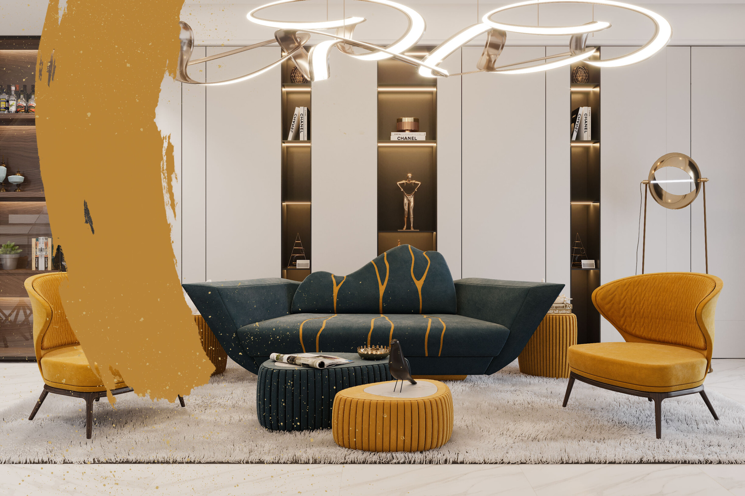
It is a color that stimulates creativity, enhances joy, and brings energy, prosperity, and optimism to the environment. It is also a tone that encourages logical thinking, enlightenment, and communication.
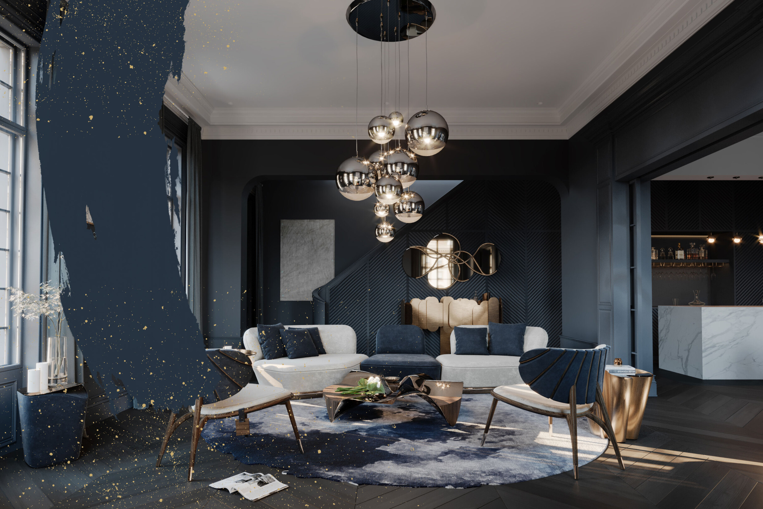
The deepest shades of blue, such as navy blue, convey trust, loyalty, and success. On the other hand, lighter tones emanate a sense of calm and tranquillity. It is also a color that encourages communication, commonly used in offices.
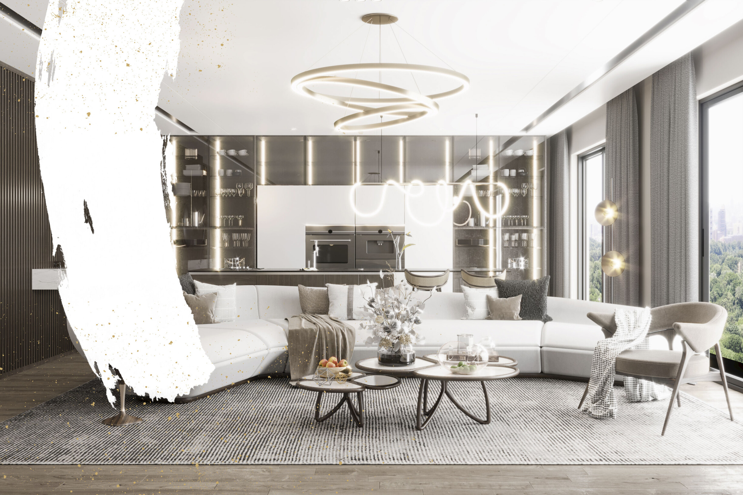
It is the color associated with wisdom, peace, and hygiene. It can convey calm and simplicity, but when used in excess, it can generate a feeling of emptiness and isolation.
It is one of the most vibrant and stimulating colors because it is dominant and dynamic. It transmits energy and emotion and causes passionate and intense reactions, but if used excessively, it can accelerate metabolism. It is sometimes a demanding tone to incorporate, but it can be used in distinctive details, such as the Harlequin armchair from ALMA DE LUCE, which has a point in the Red Dress tone that distinguishes it.
It refers to balance, health, renewal, tranquillity, security, stability, and calm. Unlike red, it's a restful eye color that we associate with nature and, as such, has a relaxing, calming vibe.
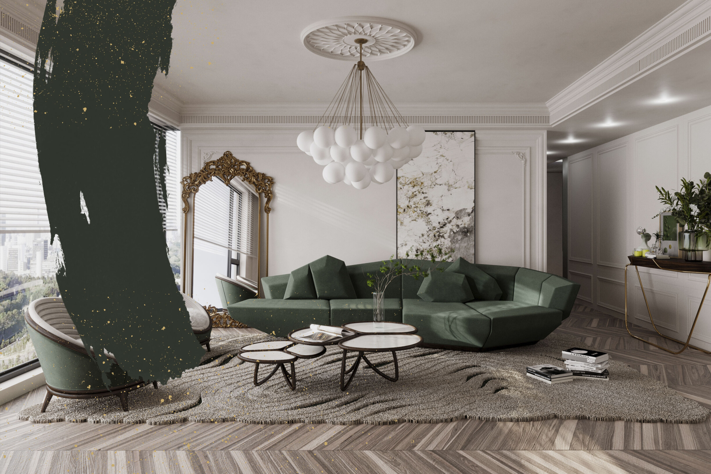
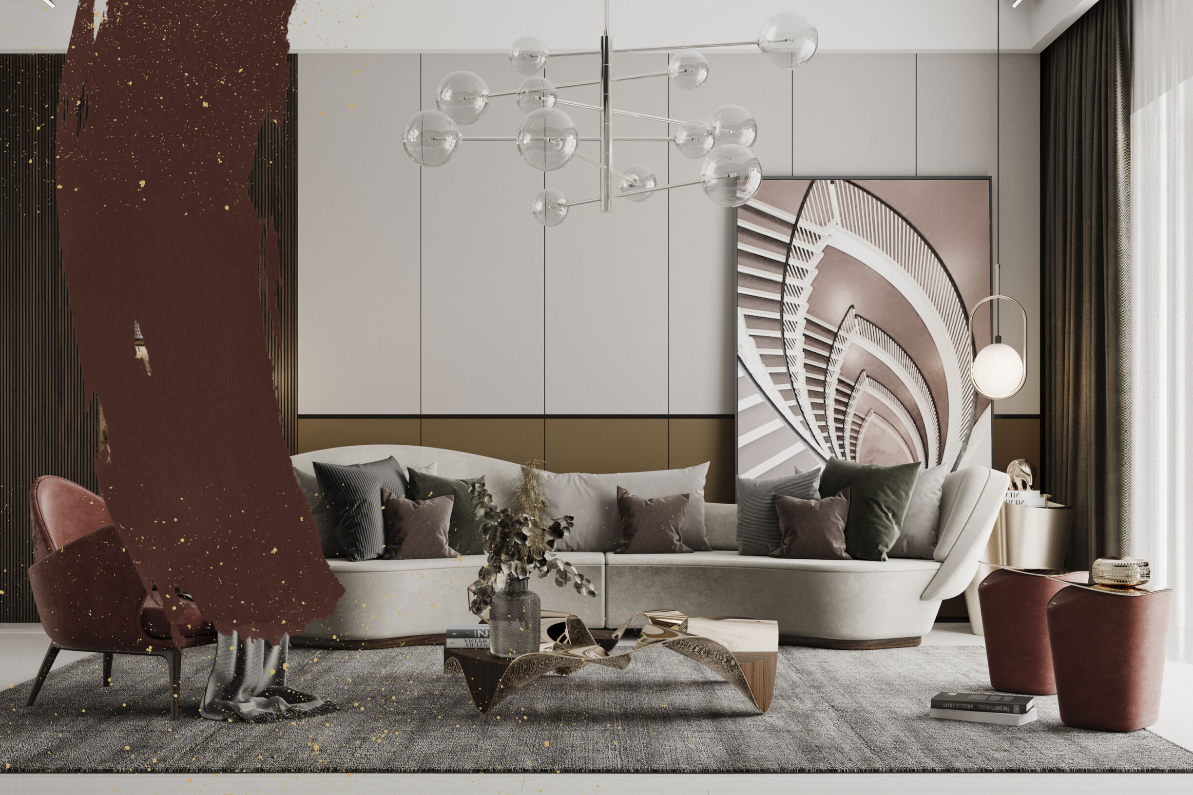
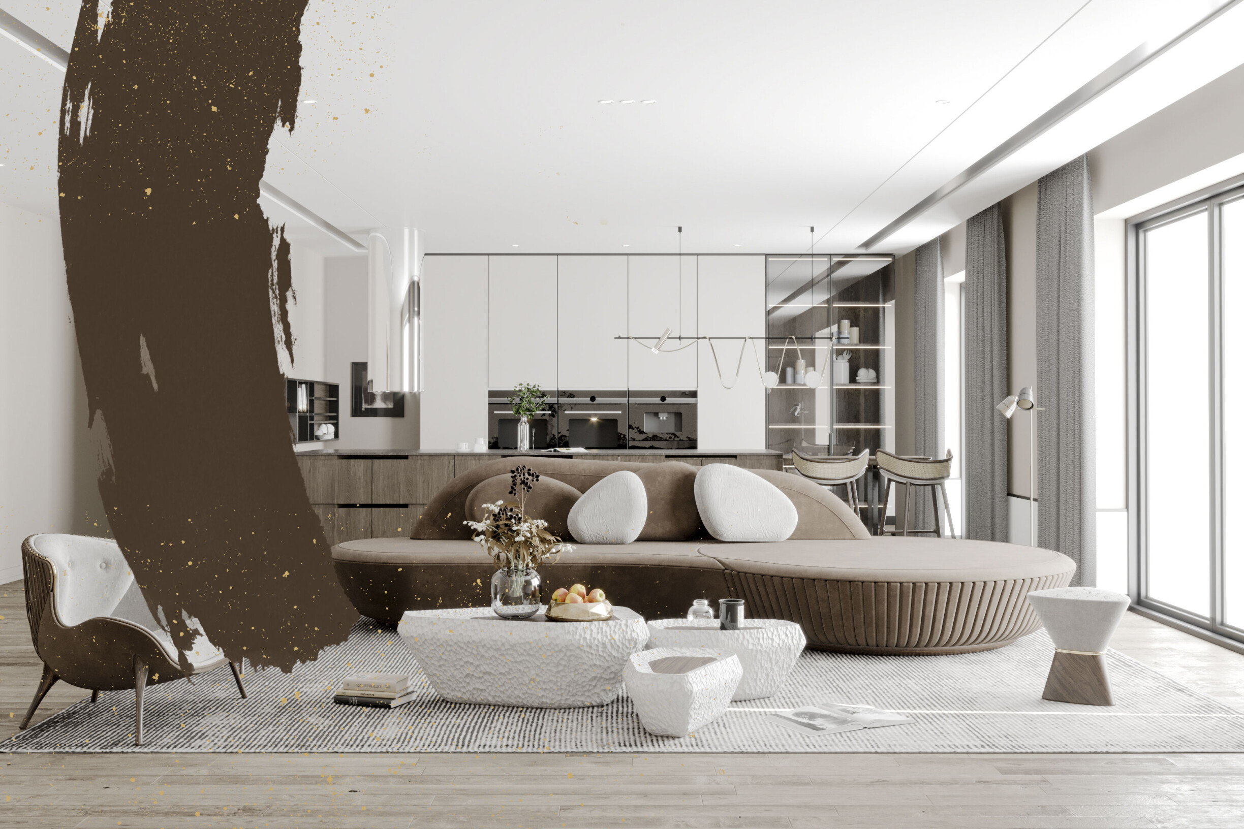
It is associated with comfort and relaxation as a symbol of support and stability. It is also a color that encourages organization and refers to nature, being, therefore, one of the main color trends of the last seasons, as you can see here. The more golden tones give luxury to the environment.
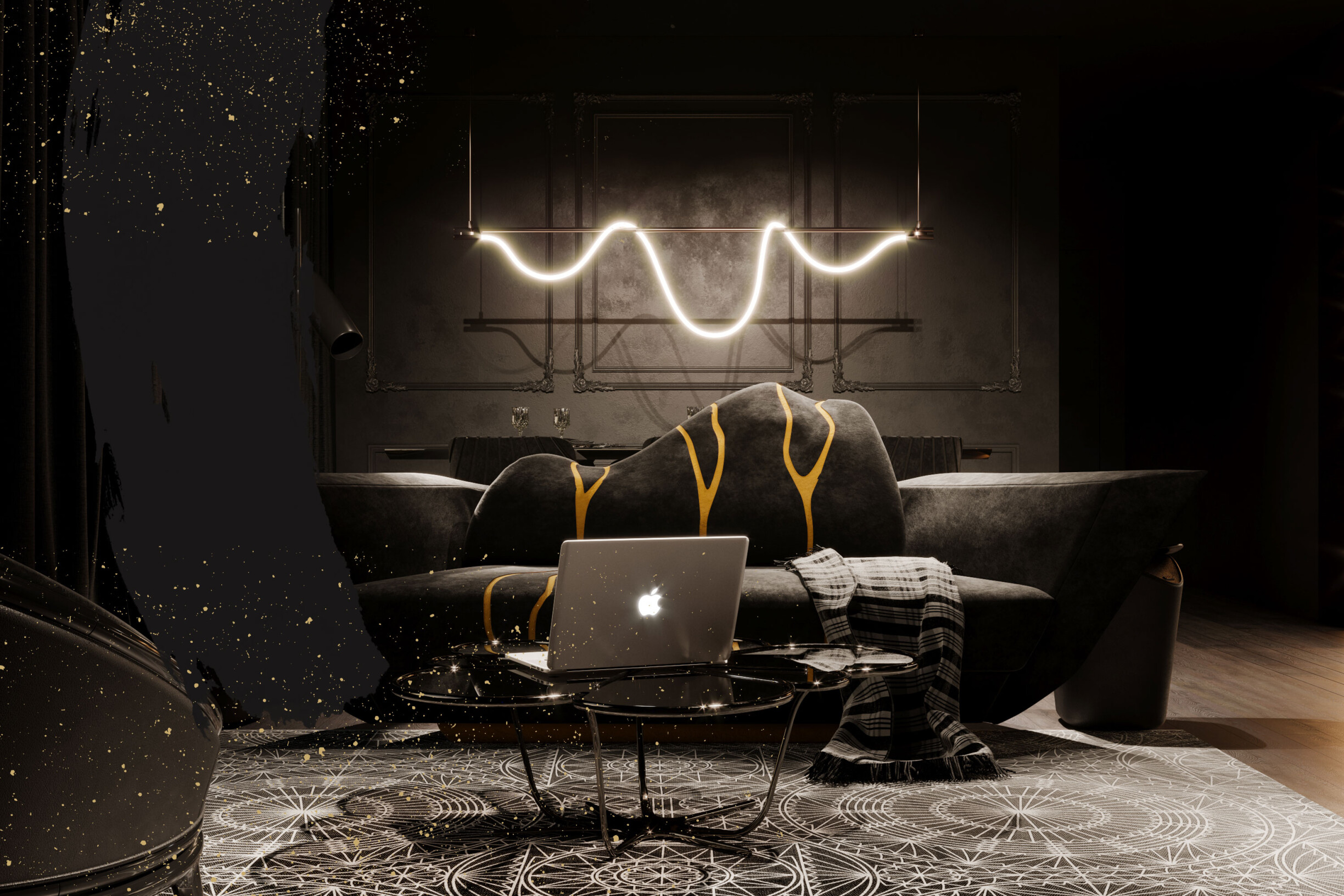
Black is a neutral tone that guarantees sophistication, modernity and elegance in a room. It is a color widely used in modern environments, but in excess, it can generate a hostile environment.
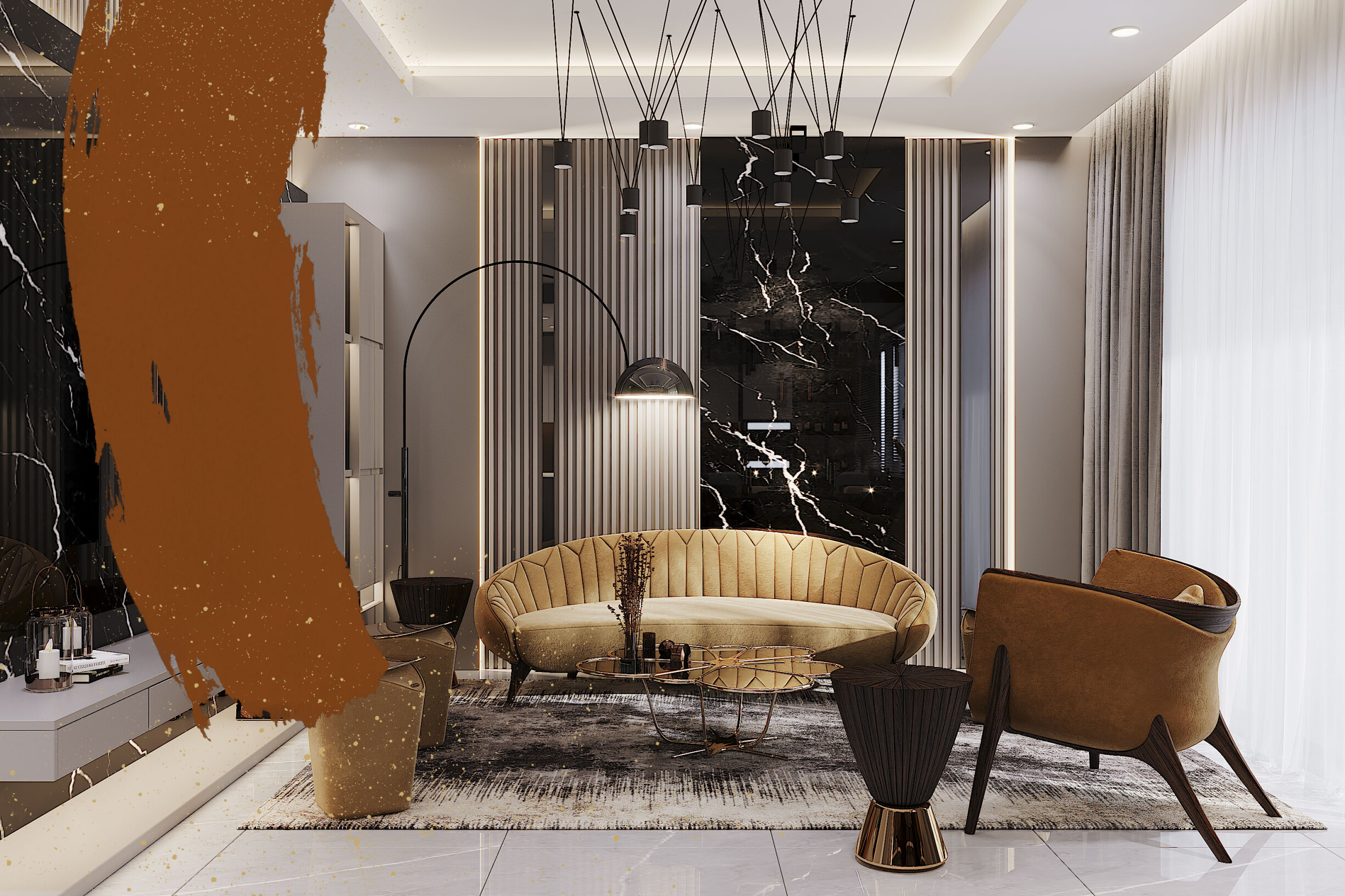
It is an exotic, penetrating, stimulating, and uplifting color associated with success, creativity, and enthusiasm.
"Colors define spaces and sensations. They shape the light, transform the house, call us or throw us"
Guta Moura Guedes.
Guta Moura Guedes, whose work stands out internationally in culture, design and architecture, reflects the importance of colors in this phrase. So, more than knowing what colors mean or convey, it is essential for an interior designer to understand the power that colors have to shape light, transform a room or a house, attract people to its interior, or push them away.
See some inspirations on Alma de Luce's Pinterest that best suit your needs, your tastes, or your client's desires. Once you're inspired, want some help getting started? Contact us here.😉