Colours play a fundamental role in creating areas that reflect personality and style. An impeccable interior design is balanced, so the choice of colours or tones for each element will make all the difference to the final result. Warm and cool colours stand out for their unique characteristics and distinct influences on interior decoration. The balance, or imbalance, of warm and cool colours in a space can completely alter the feeling it conveys.
Warm colours, such as red, orange or yellow, give a feeling of warmth and vitality. They can create welcoming and energizing spaces for socializing and entertaining. On the other hand, cool colours such as blue, green or violet, convey an atmosphere of tranquility and serenity. These colours are often used in spaces for relaxation and contemplation, such as bedrooms.
The colour palette you choose can influence the mood, style, and overall feel of the space, therefore it's essential to choose wisely. So get ready to dive into the fascinating world of colour harmony and discover how warm and cool colours can transform spaces and influence your customers' experience.
When decorating spaces, it's essential to understand the distinction between warm and cool colours. By understanding the characteristics and applications of these tones, interior designers can create aesthetically pleasing spaces and positively influence the mood and well-being of the occupants.
The colour wheel clearly shows the difference between warm and cool colours. All colours that contain yellow and red are considered warm, and those that include blue and green are considered cool.
A curious fact: German psychologist Wilhelm Wundt (1832-1920) devised the concept of colour temperature according to the sensations of heat and cold.
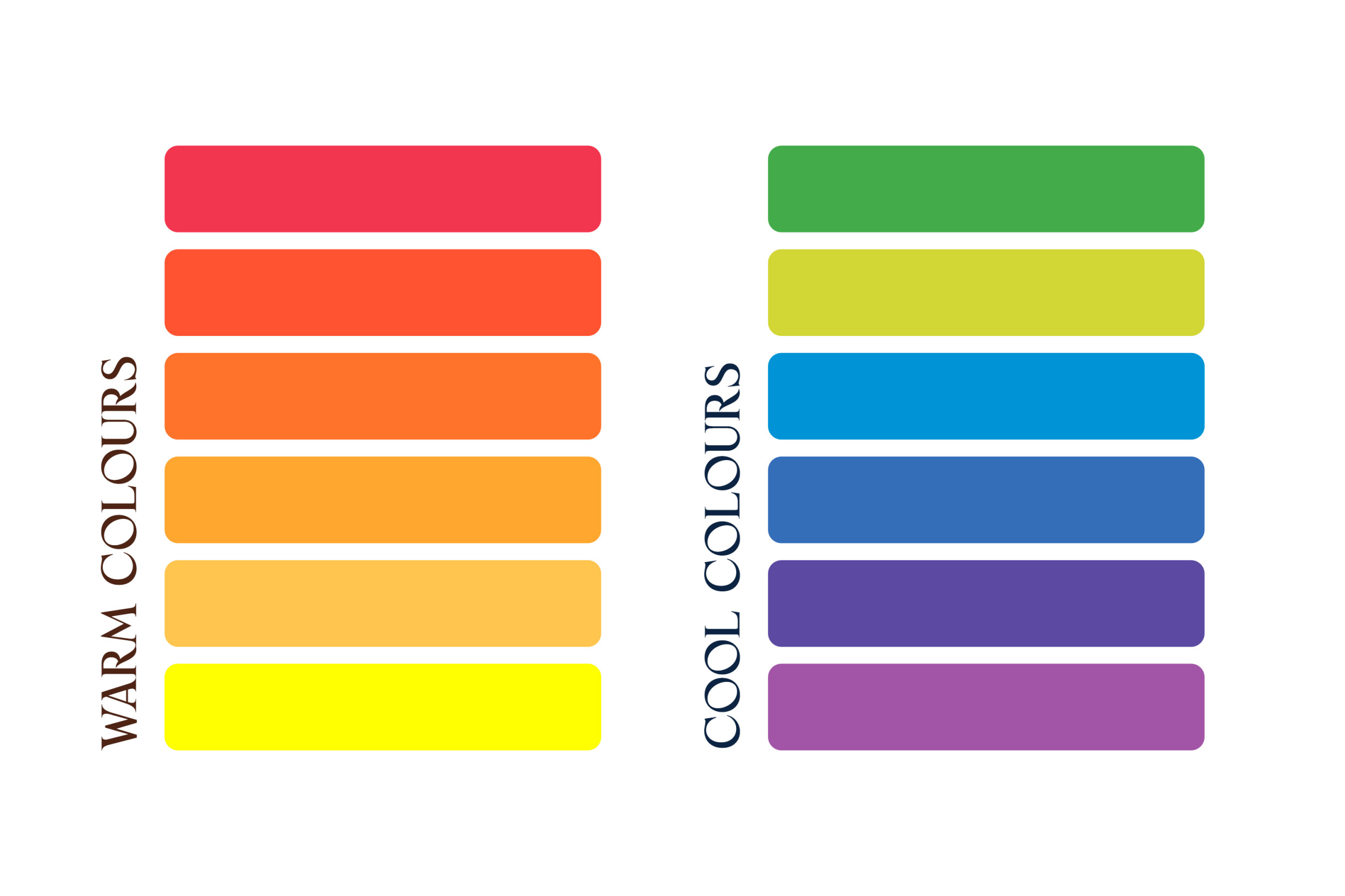
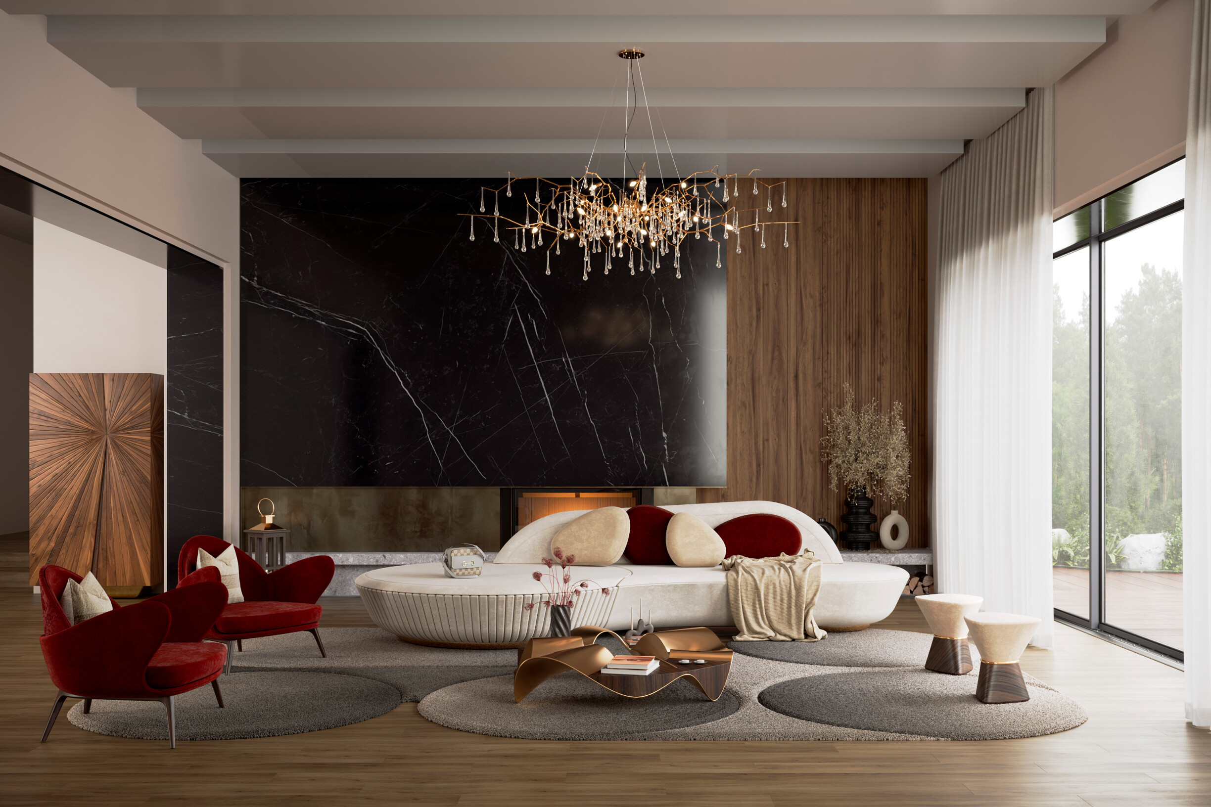
Warm colours include shades of red, orange, brown, yellow, gold, beige, and white with creamy undertones. For example, two trend colours for 2024 - Midnight Plum and Apricot Crush - are warm. These colours radiate warmth, relaxation, joy, and energy. A living room decorated in shades of red and orange, with cushions, rugs, and works of art, creates a cozy and stimulating atmosphere, perfect for welcoming friends and family.
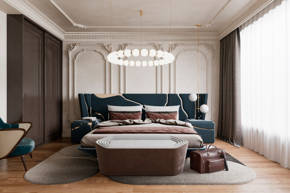
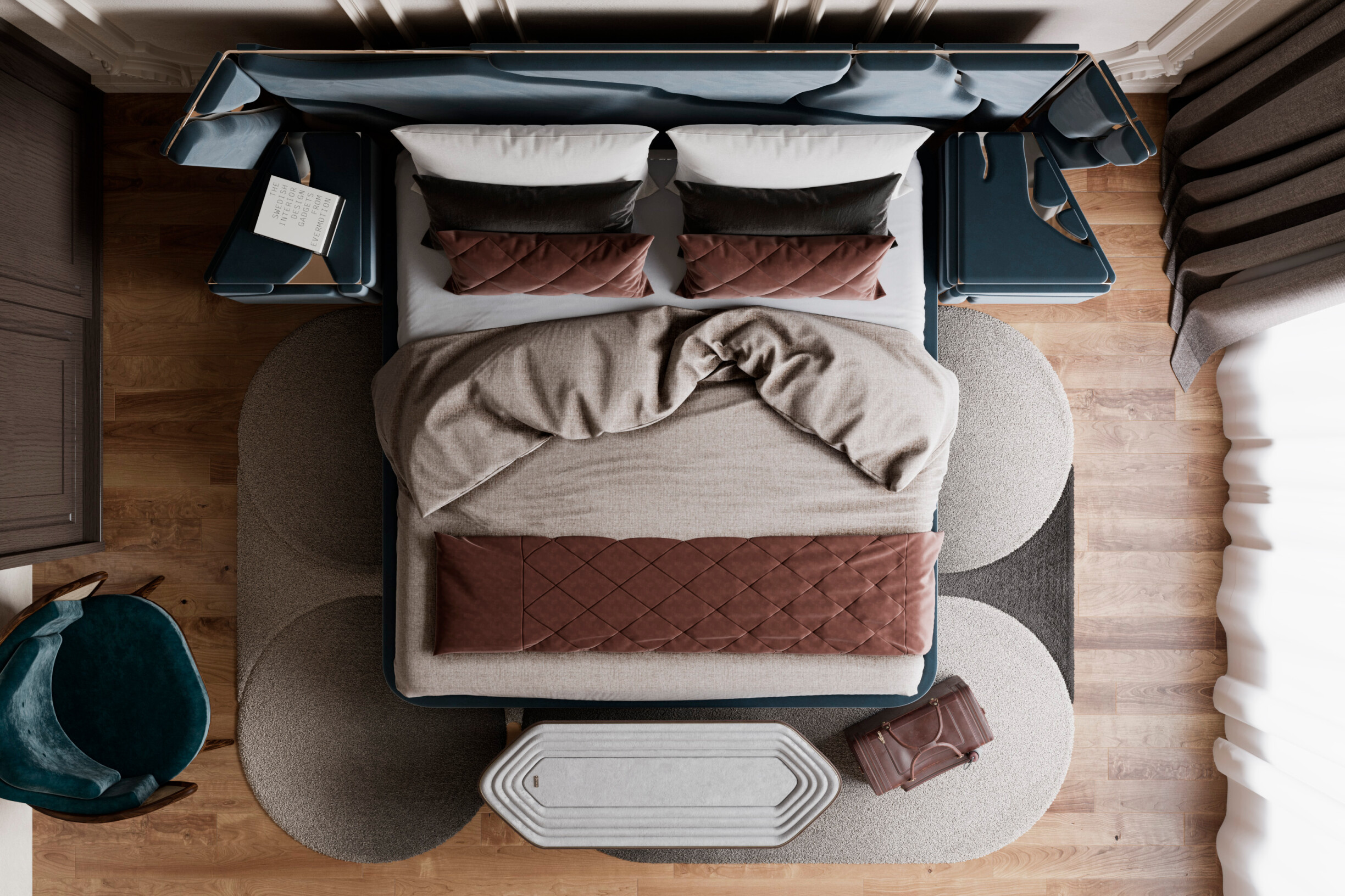
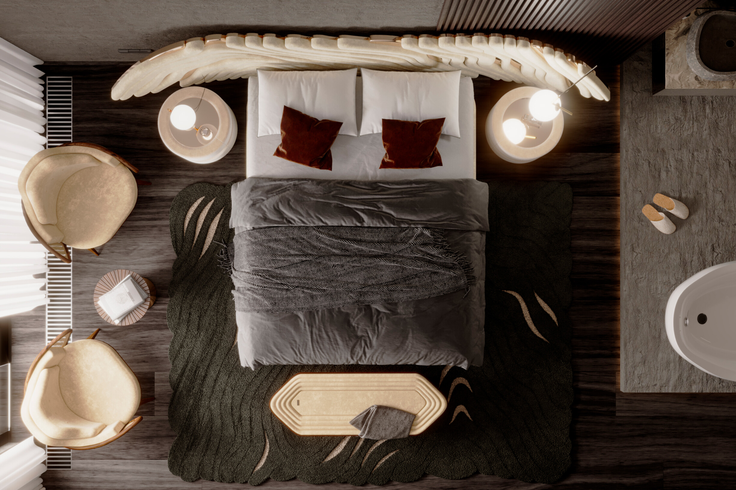
On the other hand, cool colours include blue, green, purple, gray, silver, and white with gray tones. These colours evoke a feeling of freshness, calm, nature, and tranquility and are suitable for relaxation areas. Imagine a bedroom decorated in shades of blue and green, with walls painted in muted tones and bed linen in gray and white. This combination of colours provides a serene and peaceful area, ideal for a quiet and restful night's sleep.
“I always love how colour can change the look, mood, and feel of a space.”
Matthew Dickamore, interior designer
Understanding the psychology behind warm and cool colours is essential for creating areas that convey the desired emotions. Warm colours stimulate and energize, while cool colours calm and relax.
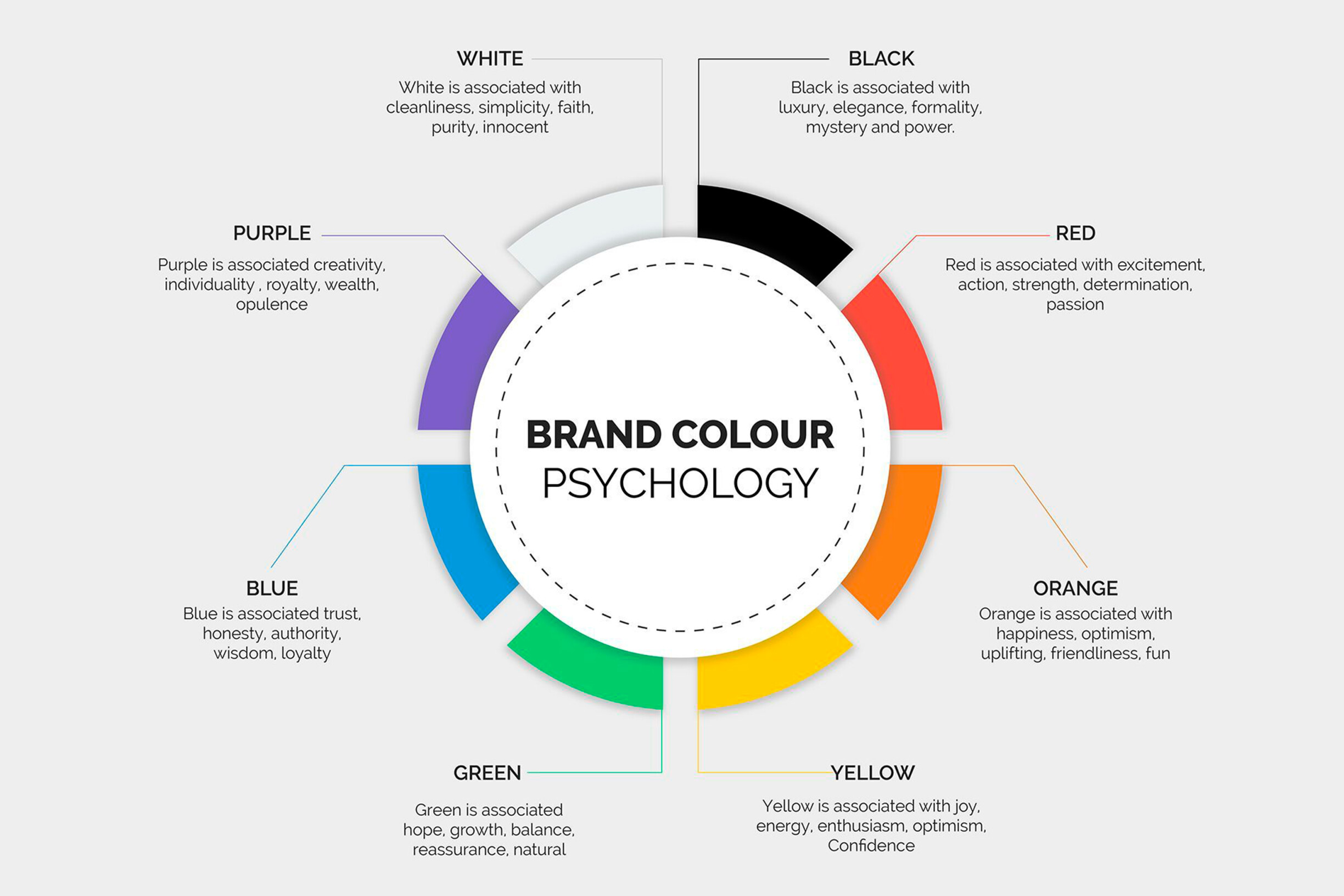
Warm colours are often associated with passion, vitality, stimulation, and optimism. They are the ideal choice for adding energy and pep to a space. Red, for example, is known to increase the heart rate and stimulate energy. Yellow is associated with happiness, creating a feeling of warmth and luminosity.
These colours work well in living and dining rooms, where people usually gather to socialize. Although they can be used in different ways to make a space cozy and inviting, they can also create a feeling of enclosure and overstimulation. That's why it's crucial to balance them with cooler tones.
Therefore, cool colours are shades that create a feeling of tranquility, serenity, and modernity. Cool colour palettes are trendy in interior design, especially in projects with minimalist or Scandinavian influences. This type of colour works well in bedrooms, bathrooms, and workspaces. For example, blue is often used in work areas because it reduces stress and promotes serenity. However, it's important to remember that too many cold tones in a space can cause it to lose its sense of coziness and comfort.
Understanding how colours affect human emotions and behavior allows interior designers to create projects that meet their clients' needs and desires. Still, the trick is to harmonize warm and cool colours best.
Harmonizing warm and cool tones in interior decoration requires balance and aesthetic sensitivity. Strategically combining these two colour groups can create visually interesting and emotionally engaging spaces.
A common approach to harmonizing warm and cool colours is subtly contrasting them. Reserving the warm tones for prominent elements can add a vibrant touch to the decor.
For example, visualize a living room with predominantly cool tones like blue. This room can be warmed up by adding decorative accessories in shades of orange or yellow, such as the Cappadocia stool or the Darvaza side table from ALMA de LUCE. This soft contrast creates a visual balance and adds depth to the space.
However, the best way to ensure the perfect match for these subtle contrasts is to create a moodboard, which allows you to see all your ideas.
Neutral colours play a crucial role in harmonizing warm and cool tones. The elegance and sophistication of neutral colours such as white, gray, and beige act as a bridge, smoothing the transition between opposing colours and creating a neutral base for the decor.
For example, a home office with teal-colored walls can complement natural wood furniture and white details, providing balance and sophistication. Another example is a home office in shades of gray, which can be brought to life with a red velvet armchair like Cinnabar from ALMA de LUCE.
Along with colours, patterns and textures also play essential roles in harmonizing spaces. Combining patterned fabrics and varied textures in a warm or cool colour palette can add visual interest and create a warm and inviting atmosphere.
The influence of textures and the importance of choosing fabrics in interior design are two factors that make it possible to enhance warm and cool colours and ensure colour harmony.
For example, a living room with walls in soft shades of blue and furniture in neutral tones such as white and gray. To bring the space to life, you could add decorative accessories, such as cushions and blankets with geometric prints in shades of orange and yellow, creating a vibrant and dynamic contrast. In addition, rugs with rich textures, such as the Douro rug from ALMA de LUCE, can be introduced to add comfort and coziness to the room.
This combination of patterns and textures in a warm or cool colour palette not only adds visual depth to the space, but also creates a warm and inviting atmosphere where the different elements complement each other harmoniously.
In this journey through warm and cool colours in decoration, we explore a universe of possibilities where shades intertwine to create unique and engaging spaces. From vibrant reds and oranges that warm the heart to soft blues and greens that soothe the soul, each hue can transform a space with its unique energy.
Following our tips, mixing and matching warm and cool colours in decor will be much simpler and more objective.
Did you like this blog article? Stay tuned for more information and curiosities from the universe of architecture, interiors, and construction!
You can also follow us on Instagram, Facebook, and Pinterest for updates and news.